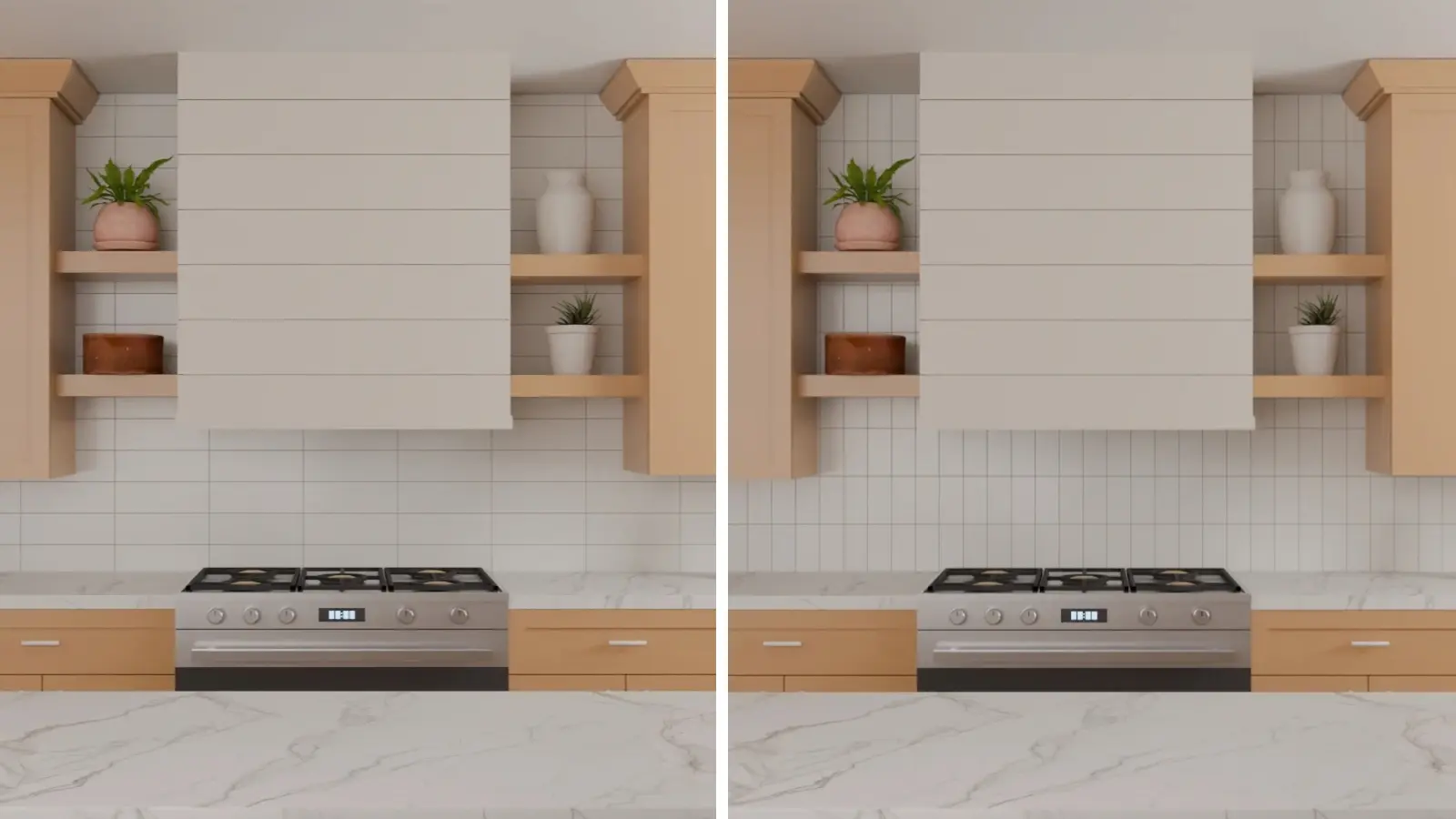
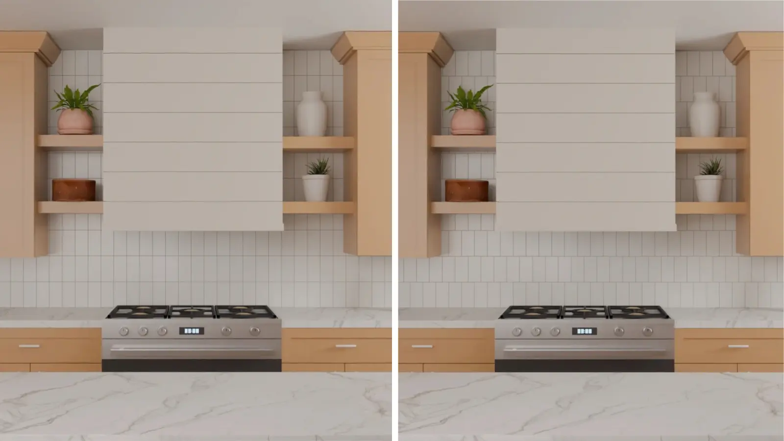
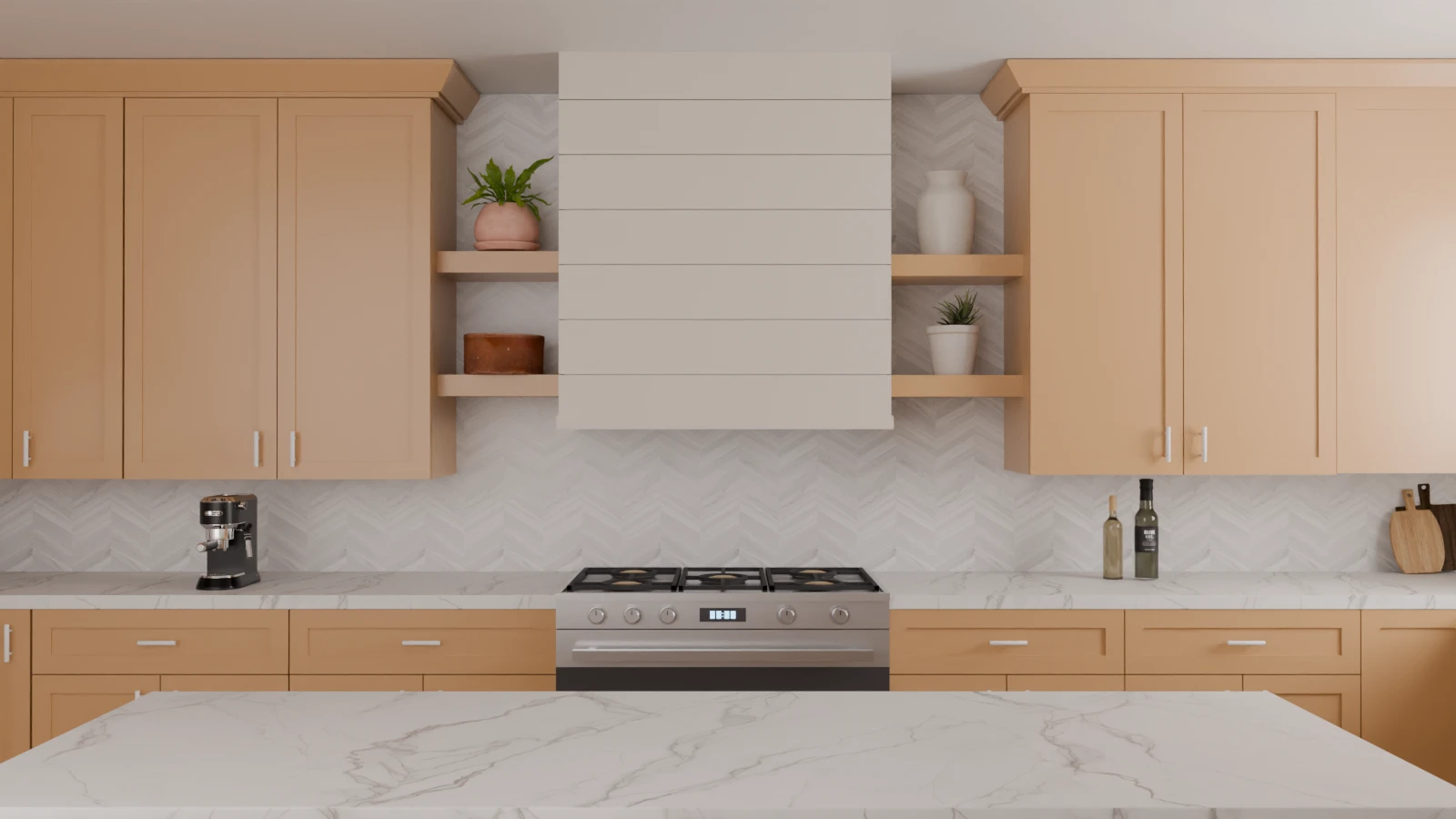
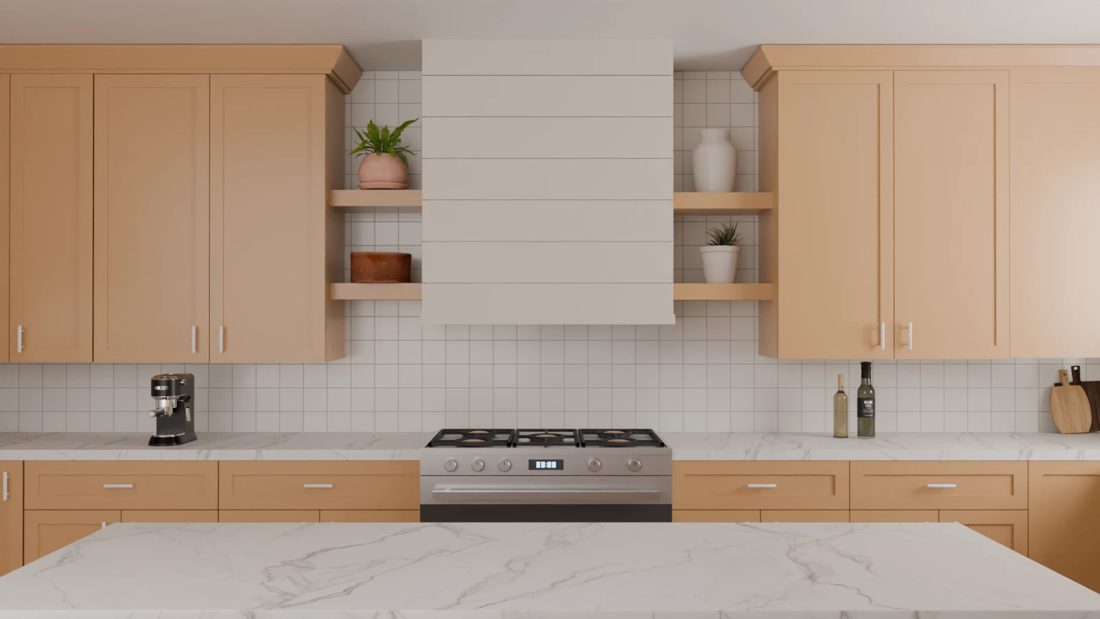
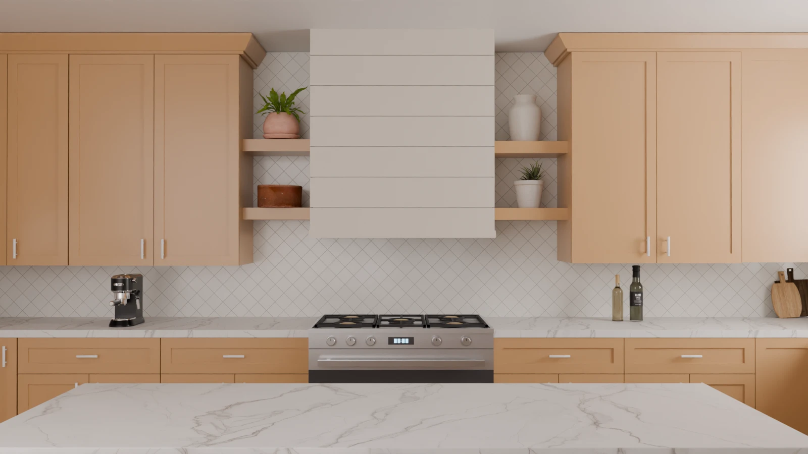
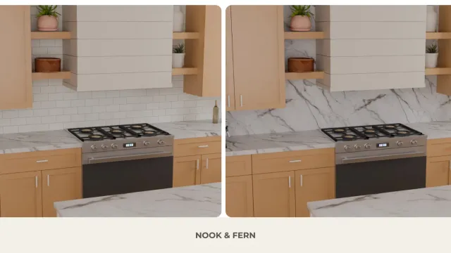
The same kitchen shown with three backsplash patterns, demonstrating how tile layout alone can change the visual rhythm of the space.
Choosing a backsplash is not just about selecting a tile. The way the tile is laid out can significantly alter the visual impact of the wall within the kitchen.
The problem when looking for ideas is that you generally end up comparing photos of completely different kitchens. The cabinets, countertops, lighting, room size, and backsplashes all vary. It then becomes difficult to determine what portion of the visual impact actually stems from the tile layout.
For this guide, we therefore we took a different approach.: We visualized ten backsplash patterns in the exact same kitchen. The cabinets, countertop, range hood, shelves, lighting, and framing remain identical; we are essentially changing the tile layout.
This allows us to compare not only the appearance of each pattern, but above all how orientation, alignment, diagonals, and scale actually alter the same composition.
Kitchen Backsplash Patterns at a Glance
Before comparing the images, a distinction must be made between two things:
The tile shape refers to its geometry: rectangle, square, etc. The layout describes how these tiles are arranged on the wall.
A single rectangular tile can thus create various compositions, depending on whether it is laid horizontally or vertically, and whether it is aligned or offset.
In our series, four variables are particularly important:
Orientation: horizontal, vertical or diagonal.
Alignment: aligned or staggered joints.
Geometry: grid, zigzag, V, diamond.
Scale: number of repetitions visible on a given surface.
Here is what to look for in our ten visualizations:
Pattern
Orientation
Alignment
Dominant geometry
What to notice
Running Bond
Horizontal
Offset
Horizontal bands
Interrupted vertical joints
Horizontal Stack
Horizontal
Aligned
Grid
Continuous columns
Vertical Stack
Vertical
Aligned
Grid
Continuous vertical lines
Vertical Running Bond
Vertical
Offset
Vertical bands
Staggered joints
Herringbone
Diagonal
Interlocking
Zigzag
Repeated changes of direction
Chevron
Diagonal
Point-to-point
V shapes
More continuous V-shapes
Square Stack
Horizontal + Vertical
Aligned
Square grid
Regular grid
Square Diagonal
Diagonal
Aligned
Diamond grid
Network of diagonals
Large-Format Stack
Horizontal
Aligned
Large grid
Fewer visible divisions
Large-Format Running Bond
Horizontal
Offset
Large bands
Fewer divisions + offset
This table does not aim to determine which pattern is the best. Instead, it provides the reader with specific elements to look for in the images that follow.
Classic Subway Tile Layouts
The rectangular tile is an excellent starting point because we can modify its orientation and alignment without completely changing its visual language.
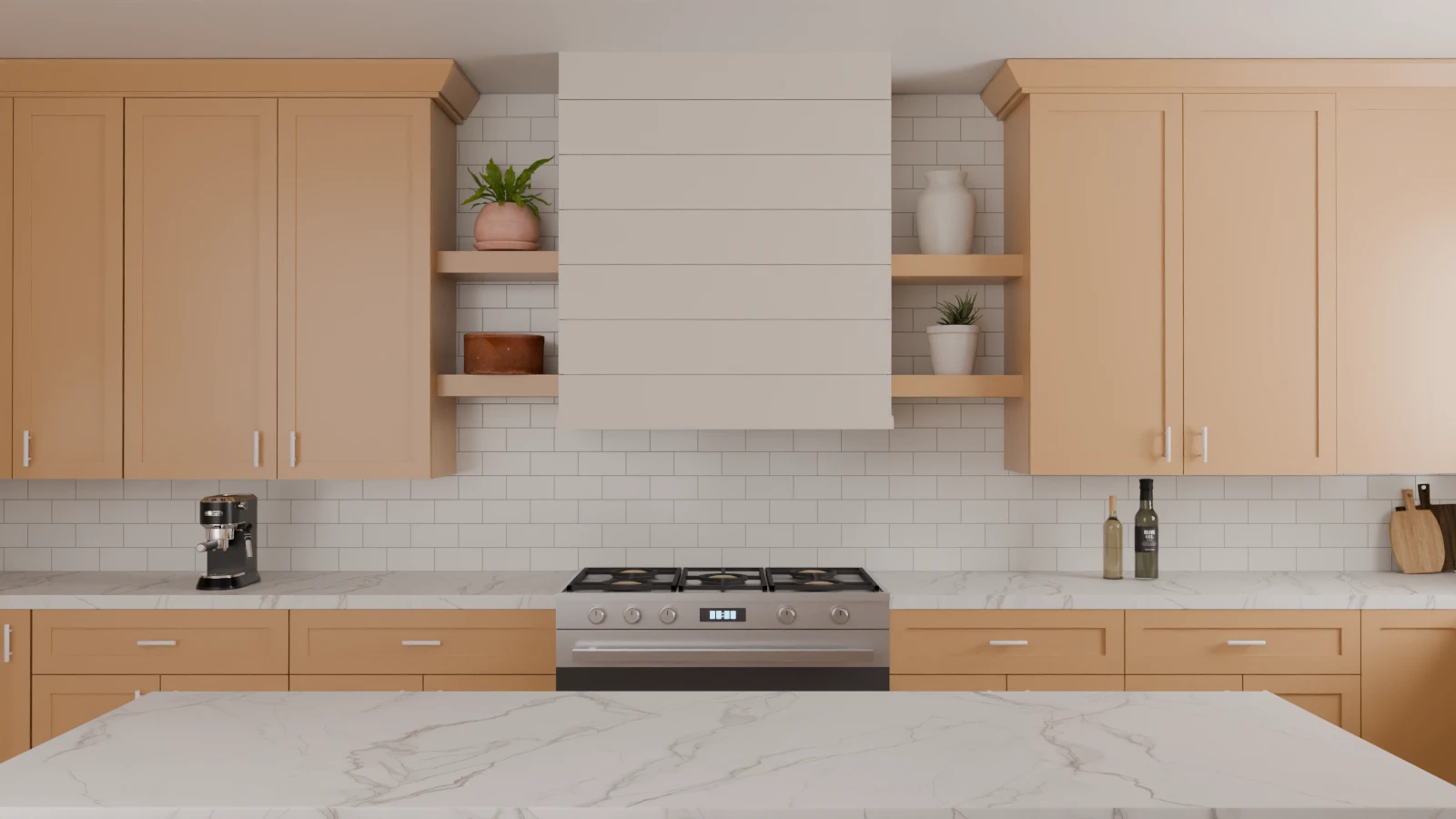
Running Bond
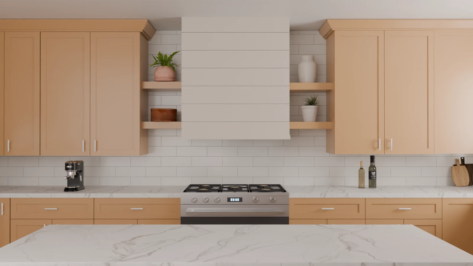
A classic running bond layout gives white subway tile a subtle sense of movement while keeping the backsplash visually calm.
The running bond uses horizontal courses with staggered vertical joints.
In our visualization, the horizontal lines remain clearly perceptible, particularly between the countertop and the shelves. However, the vertical joints do not run continuously across the surface: they break off and then reappear at a different position in the next row.
It is this interruption that will serve as our reference for understanding the stacked layout.
Horizontal Stack
A stacked subway tile layout creates clean horizontal lines, giving the backsplash a more structured and contemporary look.
The tiles remain horizontal. The essential difference is that the joints are now aligned.
Pay particular attention to the surface on either side of the range hood.
In the running bond pattern, the vertical joints were staggered. Here, they form continuous columns running from the bottom to the top of the backsplash.
The grid thus becomes a more identifiable component of the design.
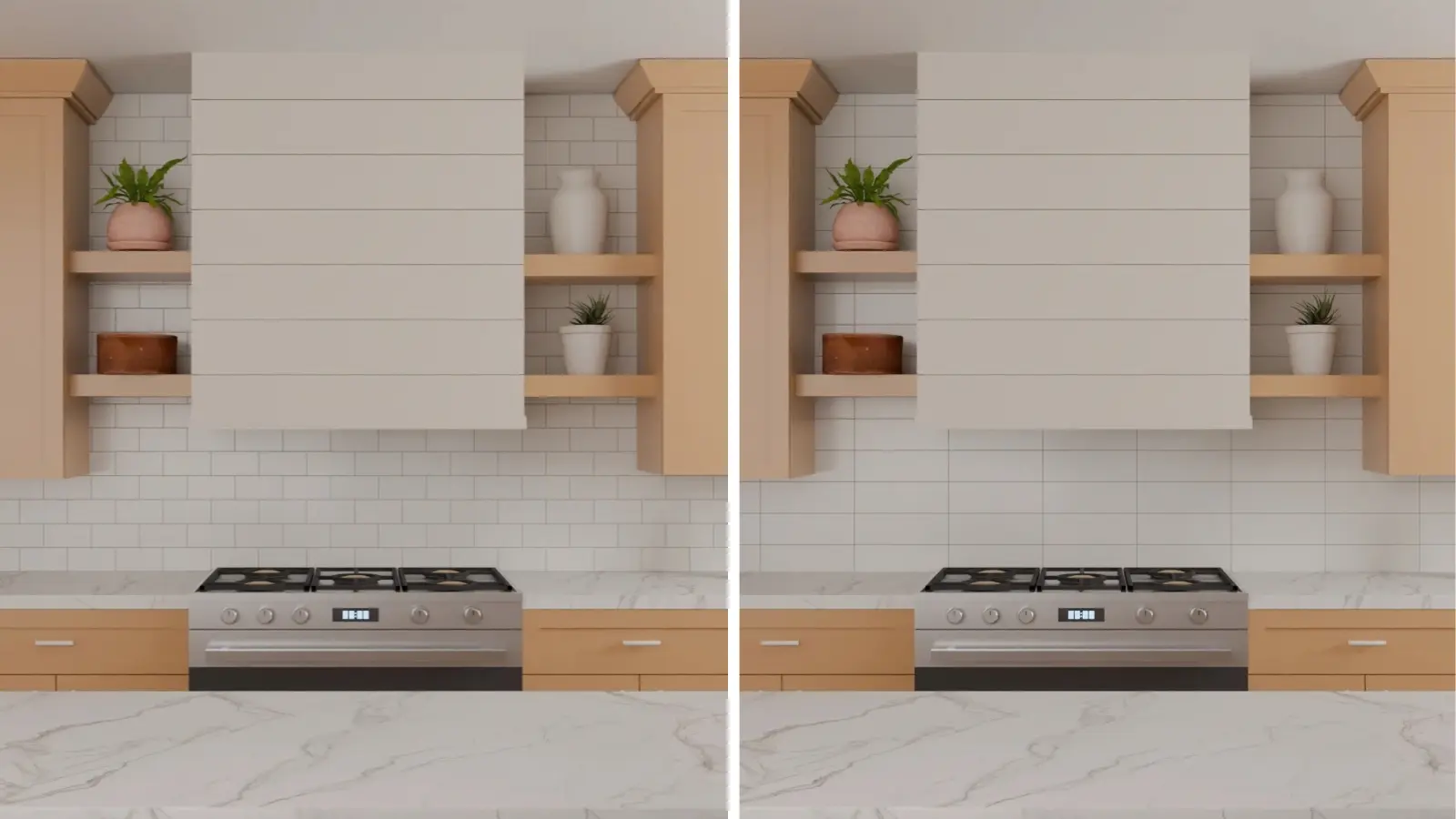
Running Bond vs. Stacked: What Changes When the Grout Lines Align?
Running bond creates a staggered rhythm, while stacked tile produces straighter, more orderly lines.
In the running bond version, the eye encounters a succession of horizontal lines interrupted by staggered vertical joints.
In the stacked version, these joints align to create a regular grid.
In other words, we can modify the rhythm of the wall without changing its dominant orientation.
This is a useful distinction when you already like a tile but are still undecided about how to lay it: the layout is not a secondary decision. It is part of the surface's final design.
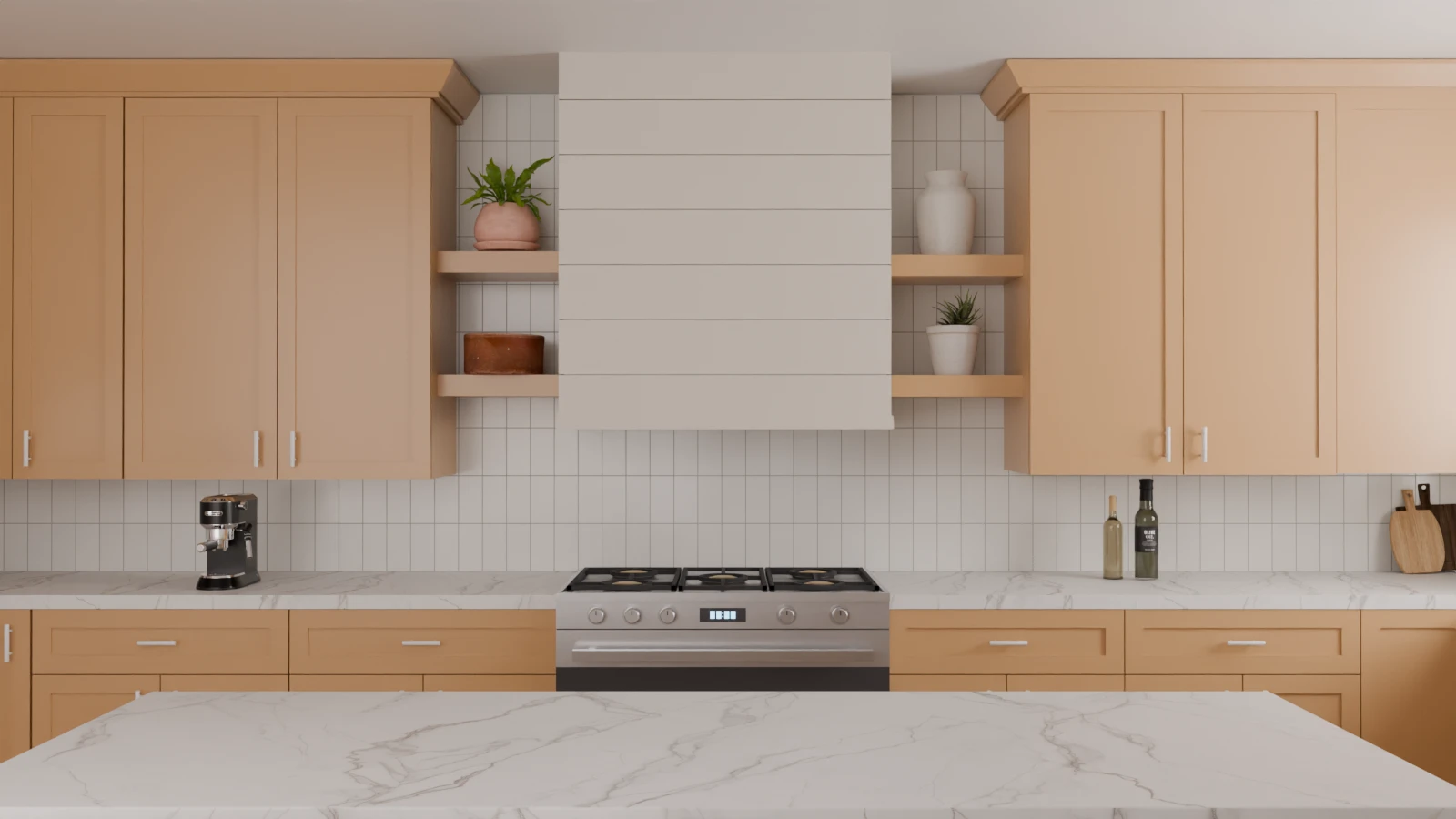
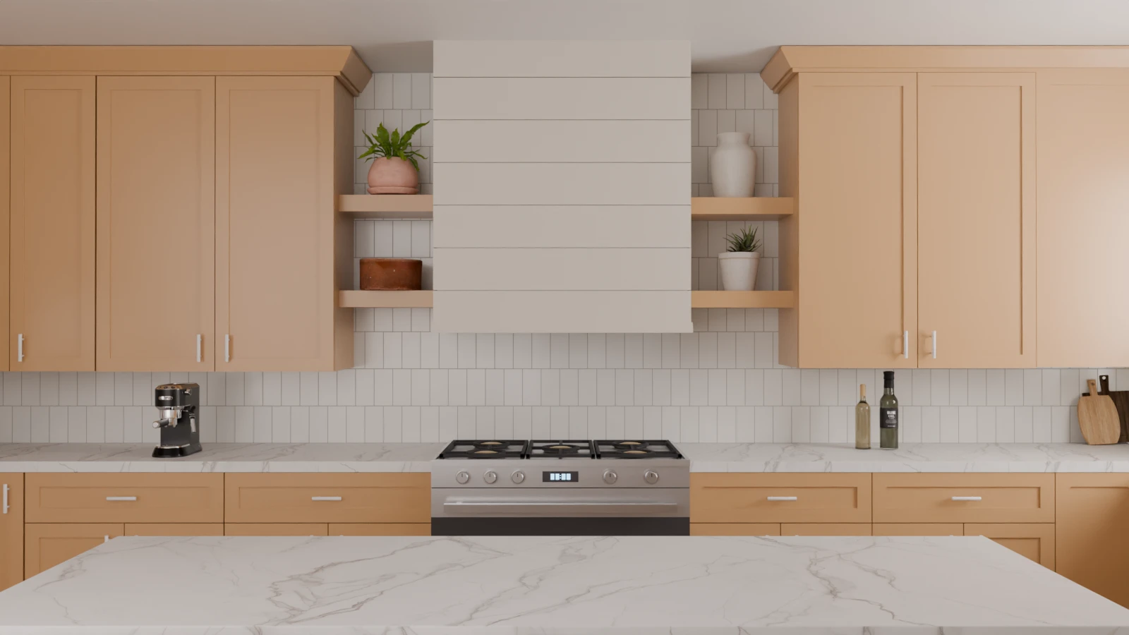
Vertical Stack
A vertical stacked subway tile layout draws the eye upward, giving the backsplash a taller, more streamlined appearance.
This time, we are changing direction.
The rectangles are oriented vertically, and their joints remain aligned.
Take another look at the areas on either side of the range hood. The vertical grout lines now create numerous lines running from the countertop up to the upper units.
It would be too simplistic to conclude that vertical tile makes every kitchen look taller. A room’s proportions depend on many other factors.
What our visualization does allow us to state much more precisely, however, is that the vertical direction becomes significantly more prominent in this composition.
Horizontal Stack vs. Vertical Stack: What Changes When We Rotate the Layout?
The same stacked layout feels wider horizontally and more height-oriented when turned vertically.
Both versions use the same stacked logic, with aligned grout joints. The key variable is orientation.
In the horizontal version, the long edges of the tiles reinforce horizontal lines already established by the countertop and open shelves. Rotate the same layout vertically, and the backsplash introduces a much stronger repetition of vertical lines.
This is why tile orientation shouldn't be treated simply as a trend choice. The direction of the pattern interacts with the architectural lines already present in the kitchen.
Vertical Running Bond
A vertical running bond layout combines an upward tile direction with staggered grout joints, creating a different rhythm from a vertical stacked pattern.
The vertical offset layout maintains the upward direction created by the vertically oriented rectangular tiles but staggers the joints from one row to the next.
Compared to a straight vertical layout, the difference is subtle but significant. The backsplash retains a strong vertical orientation, whereas staggered joints break up the continuous grid created by a perfectly aligned layout.
The result thus combines two visual movements: the tiles draw the eye upward, while the staggered joints create a more fluid, less rigid rhythm on the wall.
Vertical Stack vs. Vertical Running Bond: Alignment Still Matters
Both layouts emphasize vertical lines, but the staggered version introduces more movement.
Observe the relationship between the joints and the edges of the hood.
In the vertical stack, the aligned repetition makes the grid particularly easy to follow.
In the vertical running bond, this continuity is interrupted.
This comparison highlights an important point:
"Vertical backsplash" does not, on its own, describe the visual result.
Two layouts can share the same orientation while producing different rhythms simply because their joints do not align in the same way.
Patterns That Create More Visual Movement
Until now, the main lines were essentially horizontal or vertical.
Herringbone and Chevron introduce a different logic: the diagonal becomes dominant.
This is particularly interesting in our kitchen because the cabinets, range hood, shelves, and countertop are primarily structured around horizontal and vertical axes.
The backsplash can therefore either extend these axes or introduce an additional direction.
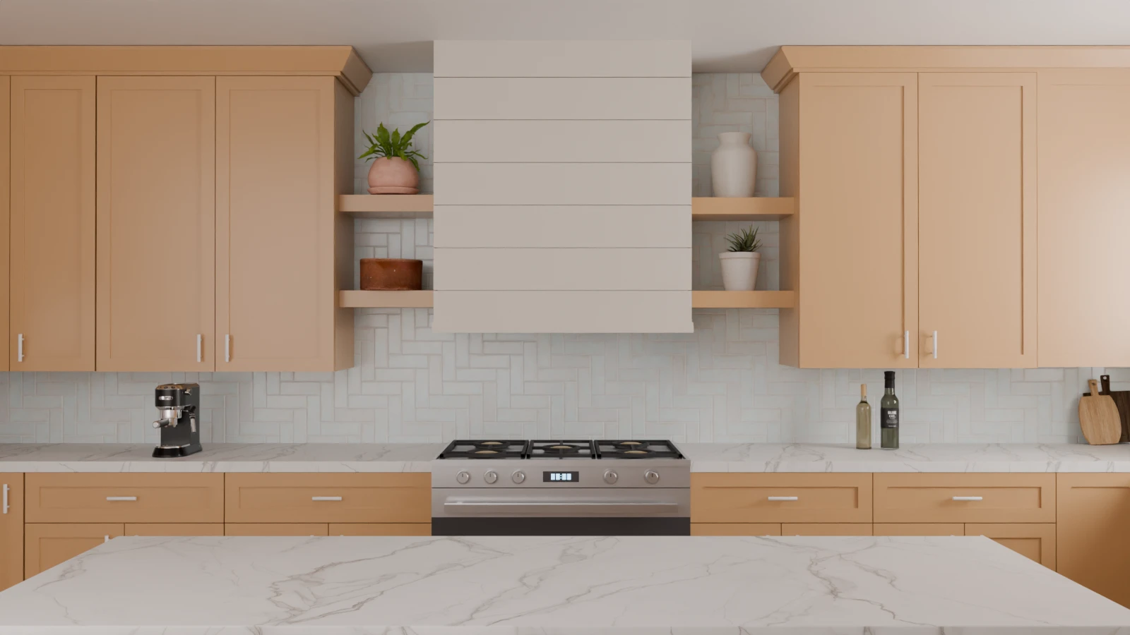
Herringbone
A white herringbone backsplash introduces diagonal movement while keeping the overall palette light and restrained.
In our herringbone pattern, the elements interlock to create a succession of diagonal directions.
Look at the area directly behind the range.
Even with a light and relatively understated color, the surface has more movement than our stacked versions.
This is an important point: a backsplash doesn’t need a high-contrast color to make a stronger visual statement. Its geometry alone can achieve some of that effect.
This can be useful when you want to maintain a restrained palette while adding more visual interest to the wall.
Chevron
A white chevron backsplash creates continuous diagonal lines that bring stronger directional movement to the kitchen.
Chevron also uses diagonals, but these meet to form more continuous V-shapes.
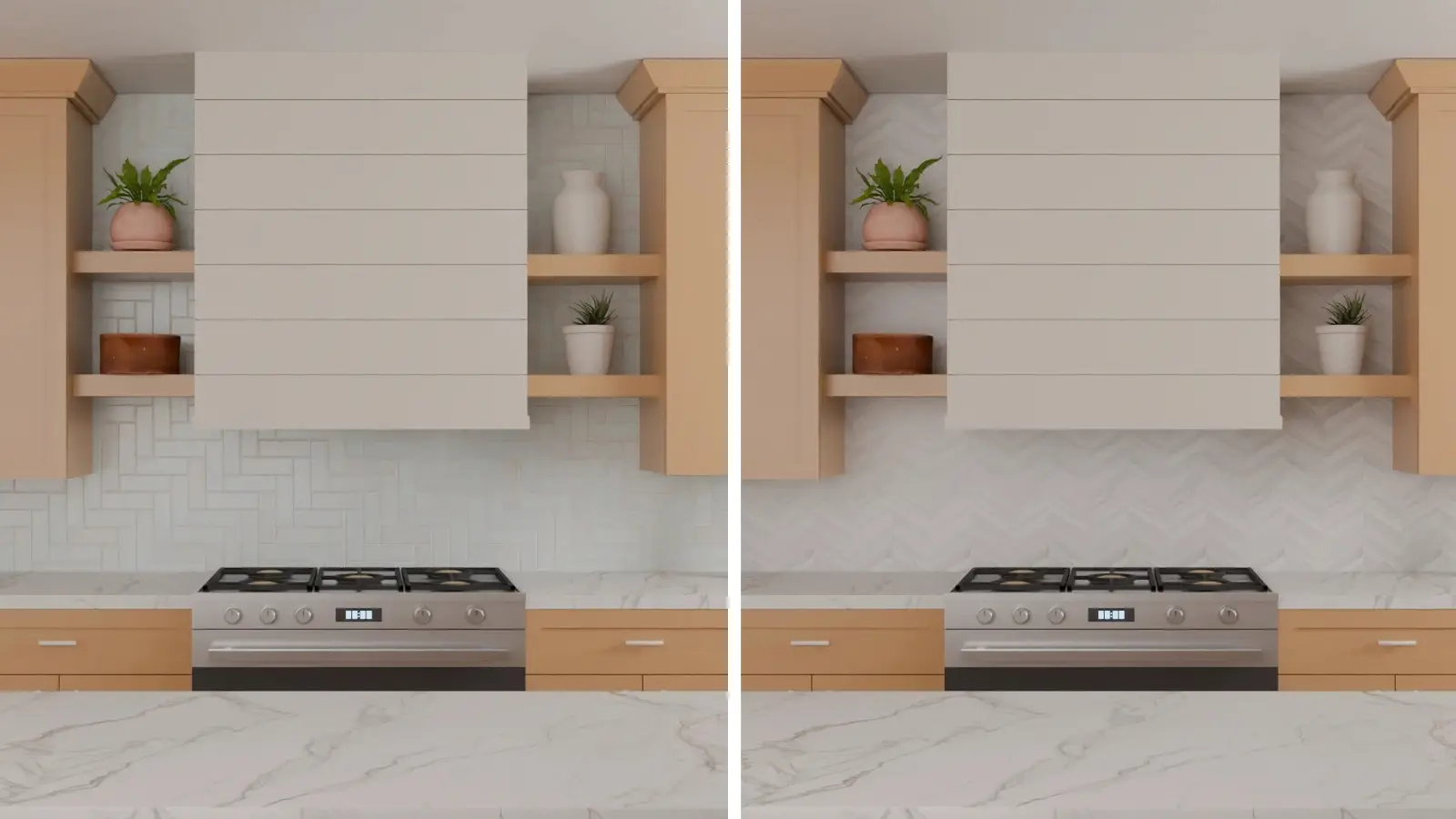
At first glance, herringbone and chevron might seem interchangeable. This is precisely the kind of comparison where looking at two different kitchens is unsatisfying.
We can do better.
Herringbone vs. Chevron: Similar Direction, Different Rhythm
Herringbone uses an interlocking zigzag, while chevron creates continuous V-shaped lines.
First, look at the center of the backsplash under the range hood, then follow the lines outward.
In the Herringbone pattern, the interlocking elements create a succession of changes in direction. In the Chevron pattern, the eye encounters more continuous V-shapes.
Both versions therefore introduce a strong diagonal component, but the way the eye traverses the wall is not exactly the same.
This is a much more useful distinction than simply asking which one is “more modern.”
If you are hesitating between the two, look instead at the rhythm they create alongside the other lines in your kitchen.
Square Tile Patterns
Our next two experiments allow us to isolate something particularly simple: the rotation of a square grid.
Square Stack
A white square tile backsplash creates an even grid of horizontal and vertical grout lines, giving the kitchen a more structured geometric rhythm.
With Square Stack, the joints form a regular grid.
In our scene, this grid naturally complements the numerous horizontal and vertical lines already present: the countertop, shelves, cabinets, range, and range hood.
No strong new direction is introduced.
This helps explain why this version appears relatively orderly in our comparison.
But be aware: this does not mean that every square tile will be understated. A high-contrast color, a bold texture, or dark grout could produce a completely different result.
Here, we are observing the layout under the conditions of our simulation, not as a universal rule.
Square Diagonal
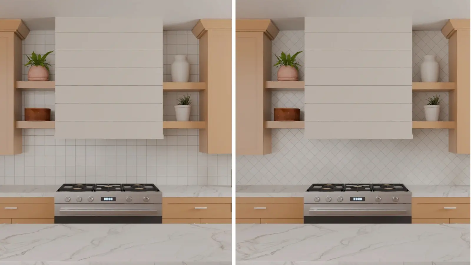
Rotating the same square tile layout diagonally replaces the straight grid with intersecting diagonal lines, creating a more dynamic visual rhythm across the backsplash.
Now, we are reorienting this rigid logic.
The joints form a network of diamonds and immediately introduce numerous diagonals.
The amount of tiled surface area has not changed.
The kitchen hasn't changed.
However, reading the wall is distinctly different.
Square Grid vs. Diagonal: What Does Rotation Alone Change?
Rotating the same square format changes a simple grid into a more dynamic diamond pattern.
This is probably our most illustrative experiment.
Look at the lines of the countertop and the shelves.
In the Square Grid, the backsplash essentially repeats these horizontal and vertical directions.
In the Diagonal Square Tile, it introduces a third direction that cuts across these axes.
That is why the second backsplash appears more dynamic, without the need to add a more dramatic color or material.
This also shows why choosing a tile based solely on a sample can be misleading.
The tile is only part of the result.
The way it repeats itself over several square meters becomes an element of the design in its own right.
Large-Format Tile Layouts
So far, we have talked a lot about orientation and alignment.
Our last two visualizations allow us to observe another variable: the apparent scale of the module.
Large-Format Stack
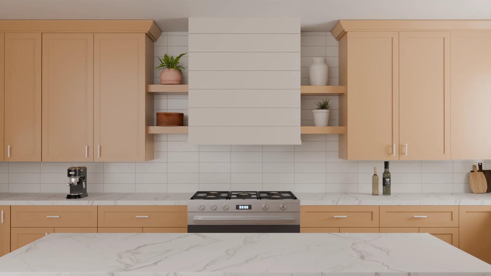
A white large-format stacked backsplash uses wider horizontal tiles and fewer grout lines, creating a broader, calmer visual rhythm across the kitchen wall.
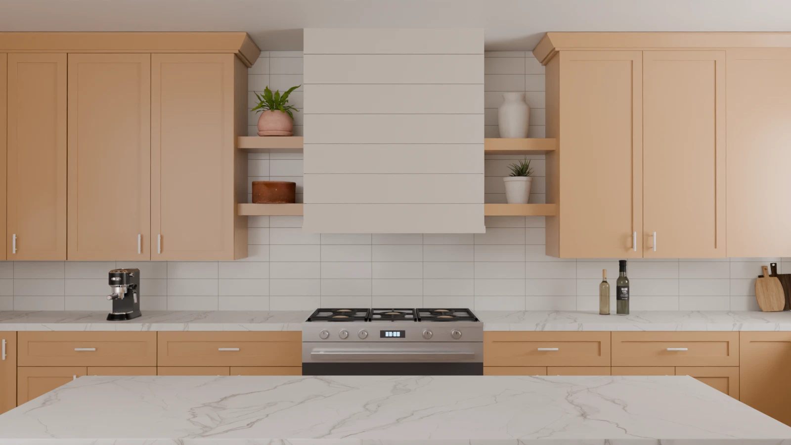
The most immediately visible difference is the number of divisions.
In this version, far fewer joints cross the surface located behind the range and around the range hood.
The backsplash is therefore divided into fewer visual segments.
This does not lead to the conclusion that a large-format tile is automatically better suited to a kitchen. Actual dimensions, cuts, installation, and the material itself introduce other considerations.
But visually, our simulation clearly shows one thing:
Reducing the number of repetitions also reduces the number of lines structuring the wall.
Large-Format Running Bond
A large-format running bond backsplash combines fewer grout lines with staggered joints, creating a broader but less rigid visual rhythm.
We are now maintaining this larger scale, but we are staggering the joints.
The number of divisions remains relatively low, while the wall resumes the characteristic rhythm of the running bond.
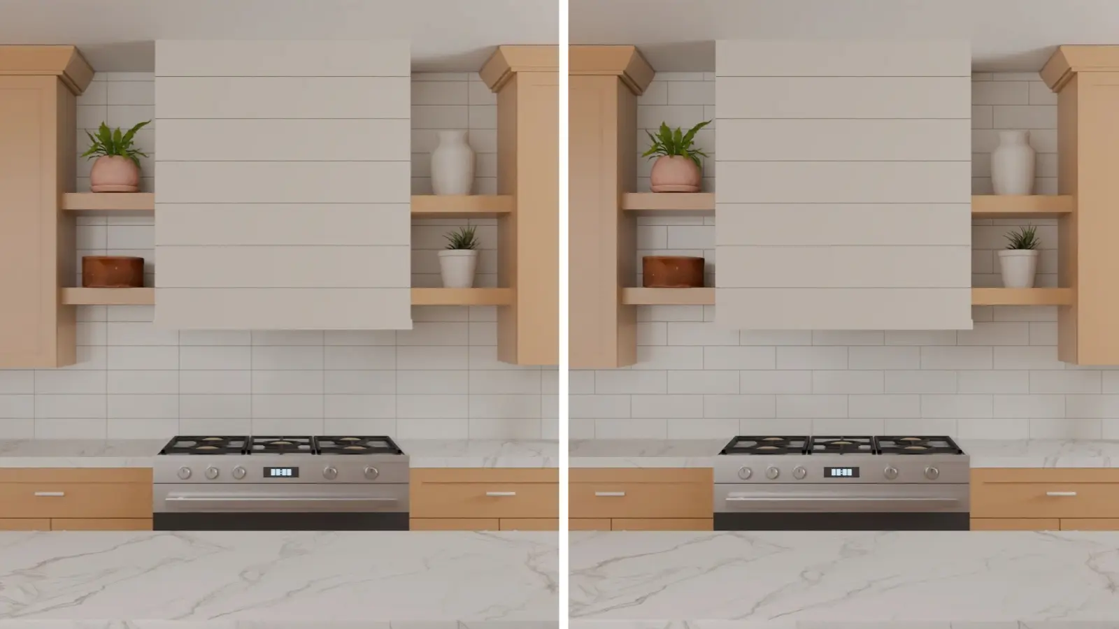
Large-Format Stacked vs. Running Bond: Fewer Lines, Different Rhythm
Stacked large-format tile emphasizes alignment; running bond breaks those joints into a staggered rhythm.
This last experiment is useful because it shows that scale and alignment are two different variables.
Both versions have relatively few divisions.
However, one forms a regular grid, while the other breaks the continuity of the vertical joints.
Even when the tiles become visually larger, the layout therefore continues to influence how the surface is organized.
How to Choose a Kitchen Backsplash Pattern
After ten visualizations, it would be tempting to look for a simple answer:
Which kitchen backsplash pattern is best?
That is probably not the most useful question.
A better question is:
What job should the backsplash do in your kitchen?
If You Want the Backsplash to Feel Visually Calmer
First, look at layouts that introduce fewer competing directions.
In our series, Square Stack and Large-Format layouts are good examples to examine.
They work differently, but they share one thing in common: they introduce fewer changes in direction than Herringbone, Chevron, or Square Diagonal.
This can be particularly appealing when other kitchen surfaces already have a strong visual presence.
If You Want to Emphasize Vertical Lines
Compare Vertical Stack and Vertical Running Bond.
Both introduce a clear vertical direction, but one maintains an aligned grid while the other breaks that continuity.
So the choice shouldn't just be horizontal or vertical.
It can also be:
Do I want those vertical lines to form a strict grid or a more staggered rhythm?
If You Want the Backsplash to Become More of a Focal Feature
Herringbone, Chevron, and Square Diagonal deserve more attention.
In our simulations, their diagonals introduce a direction that is not already dominant in the cabinetry, the countertop, and the shelving.
The backsplash therefore stands out more distinctly from the surrounding architecture.
But this also means that it must be considered alongside the other visually dominant surfaces in the kitchen.
If Your Countertop Already Has Strong Movement
This is where we need to look beyond the backsplash.
Imagine a countertop with highly directional veining. Then, add a backsplash featuring numerous diagonal lines.
The two surfaces can operate together, but they can also begin to demand attention simultaneously.
In this case, compare at least one quieter option before deciding.
To see how this works in practice, explore our guide on how to pair a kitchen backsplash with your countertop. We compare the same veined countertop with running bond and herringbone tile, showing how grout lines and pattern direction affect the visual balance.
What Actually Changes the Look of a Tile Pattern?
Across the ten visualizations, four variables consistently shape how each layout reads:
1. Orientation
Horizontal, vertical or diagonal.
Ask yourself whether the backsplash should repeat the directions already present in the kitchen or introduce a new one.
2. Alignment
Aligned or offset.
The horizontal running bond and horizontal stacked layouts, as well as the vertical stacked and vertical running bond layouts, show that two patterns can share the same overall direction while creating very different grout-line structures.
3. Geometry
Grid, zigzag, V, or diamond.
This is particularly evident when switching from stacked layouts to Herringbone, Chevron, or Square Diagonal.
4. Scale
The more the modules repeat, the more visual divisions the surface potentially contains.
Our Large-Format variants allow you to see this transformation without rebuilding a new kitchen around the tiling.
Next, a fifth variable must be added—one that is deliberately not pushed to the limit in our experiment: grout contrast.
We kept the color palette relatively neutral to make it easier to compare the layouts. With much higher-contrast grout, all that geometry would naturally become more visible.
That is precisely why the choice of a backsplash should be considered as a system:
Our ten visualizations show why choosing a tile and choosing a layout are two different decisions.
Using the same kitchen design, we were able to alter the rhythm of the wall simply by aligning or offsetting the joints, change its orientation from horizontal to vertical, introduce more movement through diagonals, or reduce the number of visible divisions by using larger formats.
So, before choosing a pattern, don't just look at the individual tile.
Look at the lines already present in your kitchen, the flow of the countertop, the main focal point, and the role you want the backsplash to play.
Then, choose the layout that contributes to this composition.