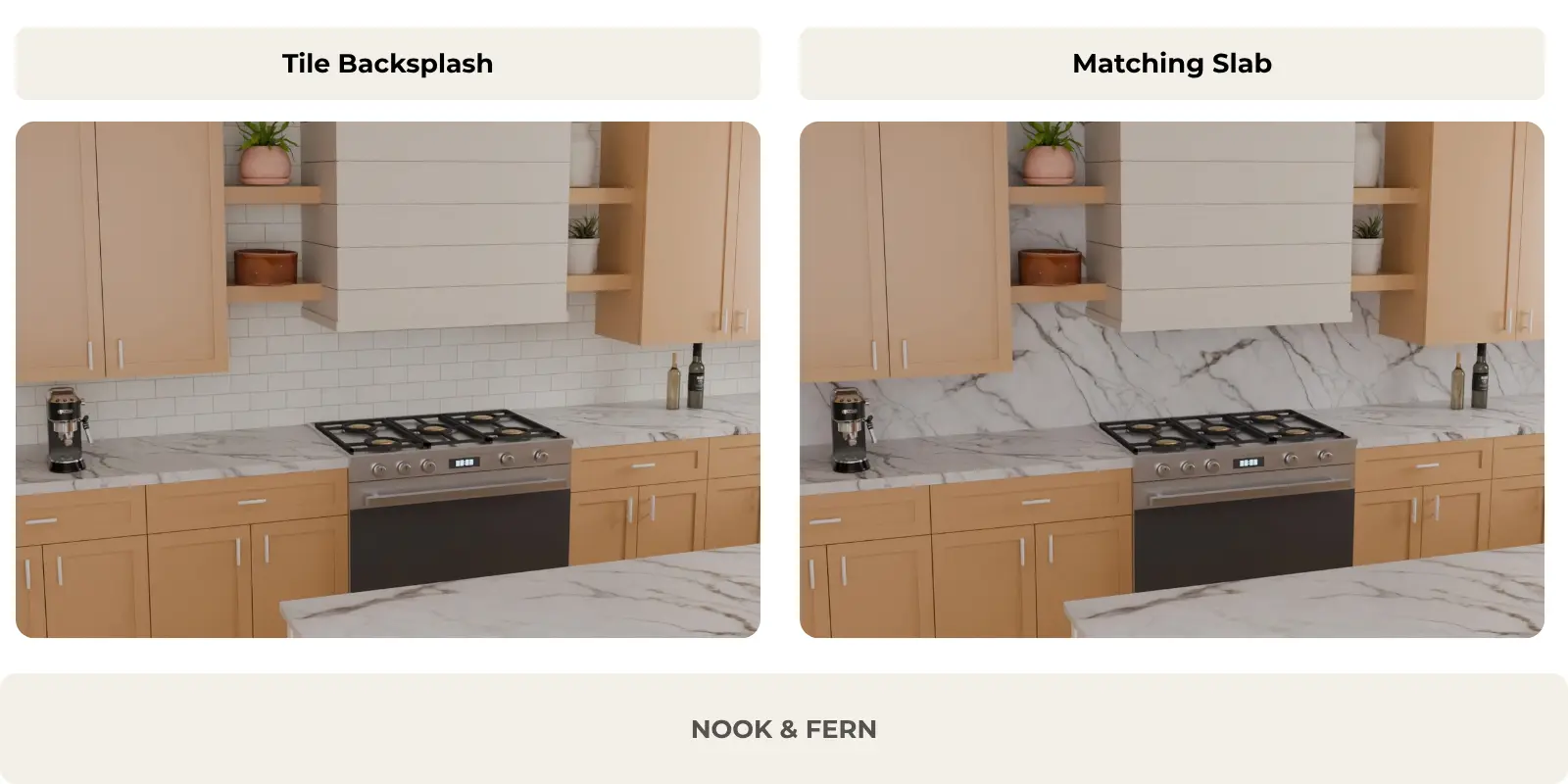
Two backsplash approaches with the same veined marble-look countertop: white subway tile creates a subtle, structured contrast, while a matching slab backsplash gives the kitchen a more continuous, stone-focused look.
Choosing a backsplash and a countertop separately might seem simple. However, two materials that look stunning on their own do not necessarily create a cohesive look when brought together in the same kitchen.
A heavily veined stone countertop can immediately catch the eye. A backsplash featuring small tiles, contrasting grout lines, or a geometric pattern can also play a significant role in the composition. When these surfaces meet, their colors, patterns, and textures influence how we perceive the space.
The right combination, therefore, is not simply a matter of finding two materials that share the same color. You need to understand how they interact.
To choose a backsplash that complements your countertop, start by identifying which surface should be the focal point. If your countertop features bold veining, a more understated backsplash is often a good starting point. If your countertop has a visually quiet appearance, you have more freedom to introduce pattern, texture, or contrast.
However, this approach is not an absolute rule. Two expressive surfaces can work well together, just as two very understated surfaces can sometimes result in a kitchen that lacks character.
In this guide, we will compare several combinations within the same kitchen—using consistent lighting and framing—to understand what actually changes when the countertop or backsplash is altered.
Decide Which Surface Should Lead the Design
Before choosing a color or material, ask yourself one question: which surface do you want to highlight?
In some kitchens, the countertop naturally serves as the focal point. This is particularly true of stones featuring bold, contrasting veining, irregular movement, or significant color variations.
In other kitchens, the countertop plays a more understated role, serving as a neutral backdrop for a decorative, textured, or geometric backsplash.
This distinction makes it—or allows for—defining a visual hierarchy: a way of organizing elements so that the eye quickly grasps what is important.
What Makes a Surface Visually Busy?
A visually expressive surface is not recognized solely by its color.
Several features may attract attention:
Contrast: dark veins against a light background are generally more visible than very subtle variations in shade.
The scale of the pattern: large veins create a different kind of movement than a fine, repetitive texture.
Density: a material featuring numerous closely spaced lines may appear more active than a surface with a few widely spaced variations.
Direction: horizontal, vertical, and diagonal lines influence the way the eye travels across the surface.
Repetition: the tile joints also create a pattern, even when all the tiles are the same color.
These characteristics explain why two white materials can produce very different results.
Heavily veined white marble and white tiling with contrasting grout lines do not necessarily serve the same purpose as a white countertop with subtle tonal variations and an ivory backsplash with unobtrusive grout lines.
Four Ways to Balance Countertop and Backsplash Patterns
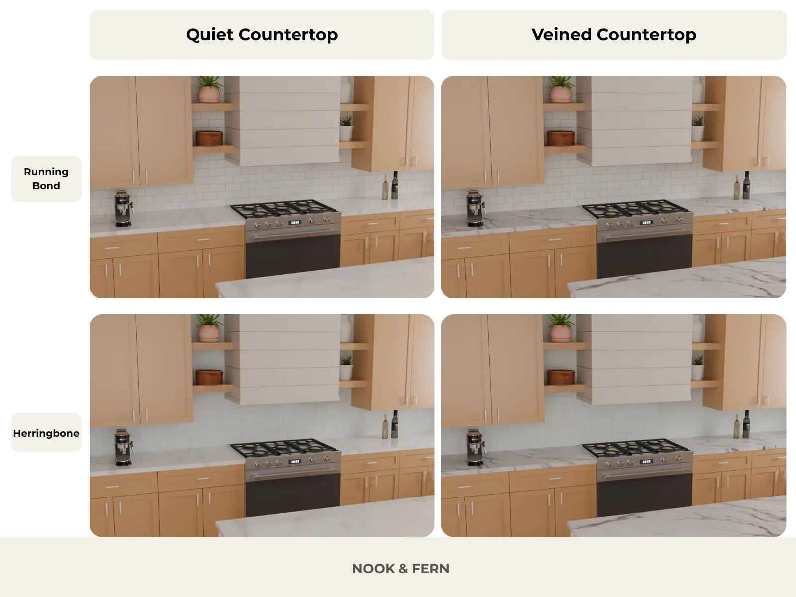
To observe these differences, we tested four combinations in exactly the same kitchen.
Four countertop and backsplash pairings shown in the same kitchen. Compare the countertop veining across columns and the tile patterns across rows to see how each changes the visual balance.
The first combination pairs a countertop with subtle veining with a white backsplash laid in a running bond pattern. Both surfaces maintain a calm, understated look, allowing the eye to focus more on the cabinetry, the volumes, and other elements of the kitchen.
In the second combination, we retain the same backsplash but replace the countertop with a stone featuring much more pronounced veining. The hierarchy shifts immediately: the stone becomes the dominant element.
The third combination retains the understated countertop but introduces a herringbone backsplash. The diagonal lines add a sense of geometric movement that was absent from the first version.
Finally, the fourth combination brings together the heavily veined countertop and the herringbone backsplash.
The result is interesting: despite the presence of two patterns, the overall look does not necessarily appear cluttered. The herringbone grout lines remain relatively subtle, whereas the veining in the countertop offers much stronger contrast.
The important lesson is that it is not enough to simply count the patterns present in a kitchen; one must observe their intensity and their relationship to one another.
Two motifs can coexist when neither attempts to dominate the composition.
What Backsplash Goes With a Busy Countertop?
A heavily veined countertop already provides a great deal of visual detail.
Its lines can traverse the surface in various directions, form concentrations of color, or create areas of strong contrast.
The backsplash should be chosen with this activity in mind.
Keep Color and Grout Contrast Restrained
An understated backsplash is often the easiest choice to balance with a striking stone.
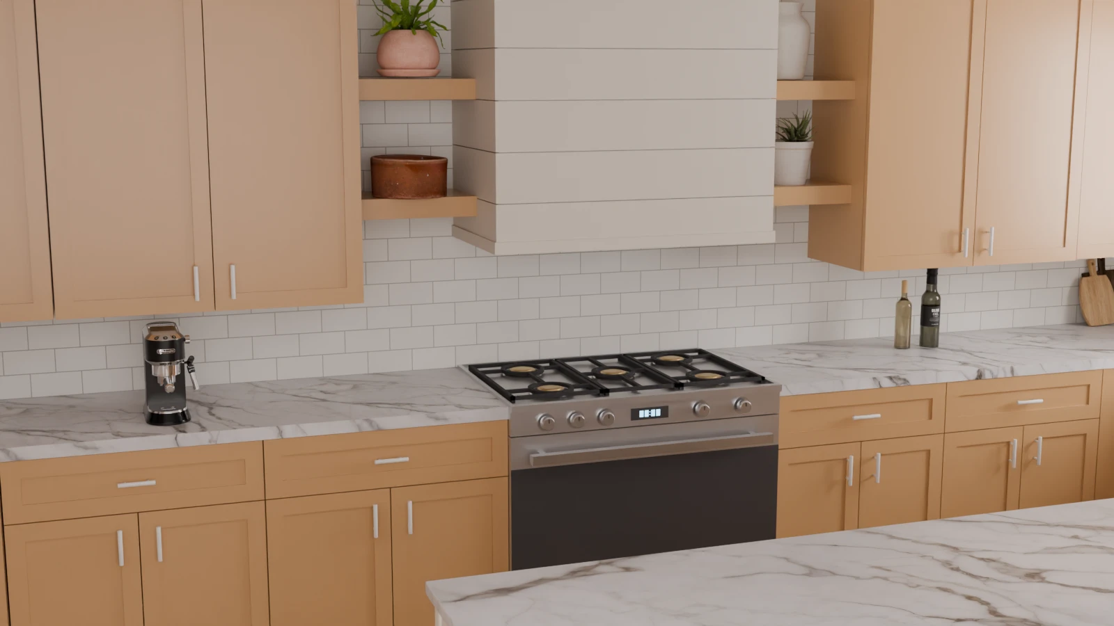
In our kitchen, the white running-bond tiling maintains a visible texture and structure without introducing a new dominant color.
The grout lines create a regular horizontal rhythm, but they remain less prominent than the large veins in the countertop.
A strongly veined countertop becomes the focal point when paired with a quiet white subway tile backsplash. The subtle grout lines add structure without competing with the stone.
This combination works because the two surfaces fulfill different roles.
The countertop provides the primary sense of movement. The backsplash offers a structured yet understated backdrop.
This does not mean that the backsplash has to be white. Ivory, soft beige, or light gray can also work, depending on the colors present in the stone.
The key is to examine the relationship between the countertop's background, its veining, and the color of the tiles.
A very dark grout line can sometimes transform otherwise neutral tiling into a high-contrast pattern. Conversely, using a grout color close to that of the tile often helps minimize the visual impact of the grid.
When a Patterned Backsplash Can Still Work
It would be too restrictive to routinely recommend a perfectly uniform backsplash with a veined countertop.
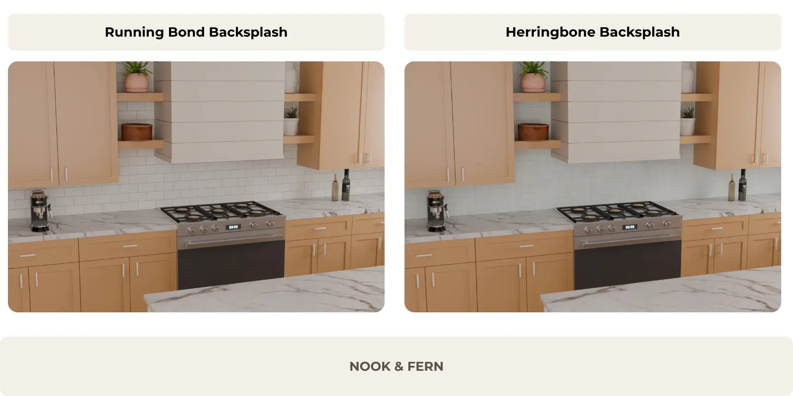
Our comparison with the herringbone pattern shows why.
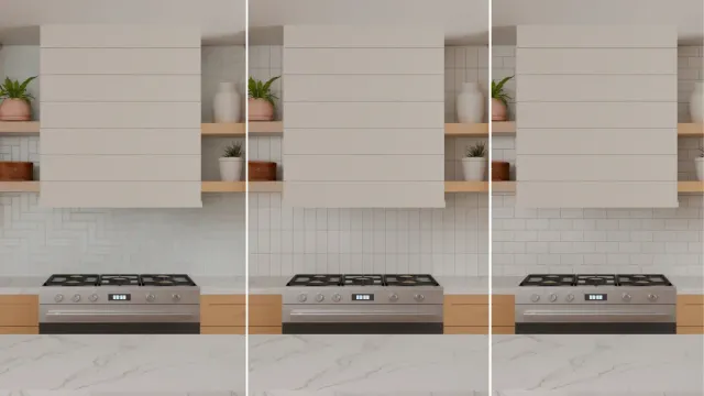
The same veined countertop paired with two backsplash patterns. Running bond creates a regular horizontal rhythm, while herringbone adds subtle diagonal movement without overpowering the stone.
In both versions, the countertop features the same large veins.
The only difference lies in the layout of the tiles.
The running bond introduces a regular horizontal rhythm, while the herringbone pattern creates a network of diagonal lines.
However, in our example, the herringbone pattern does not overpower the countertop. Its color remains light, and the grout lines offer a moderate contrast.
The pattern therefore adds texture without becoming the main focal point.
If you wish to pair a geometric backsplash with a striking stone, consider three elements: the tile color, the grout contrast, and the pattern density.
A white herringbone pattern with subtle grout lines will not yield the same result as a high-contrast black-and-white herringbone pattern.
The choice depends on the level of visual activity you wish to achieve, not on a general prohibition against mixing patterns.
Should Your Backsplash Match Your Countertop?
Another important decision involves choosing between two approaches: using a different material for the backsplash or extending the countertop material up the wall.
Both solutions can work, but they produce very different visual effects.
Option A: Complement the Countertop With Tile
A tiled backsplash introduces a distinction between horizontal and vertical surfaces.
In our first version, already presented above, the countertop features pronounced veining, while the wall is covered with rectangular white tiles.
The tile grout lines create a scale smaller than that of the stone's large veins.
This difference allows the two materials to be clearly distinguished: the countertop as an expressive surface, and the backsplash as a more uniform backdrop.
Tiling also offers great freedom of composition. Its shape, layout, finish, and grout color can alter its appearance without requiring a complete change of palette.
This approach is particularly suitable when you want to highlight the countertop while maintaining a distinct backsplash.
Option B: Continue the Countertop Material Up the Wall
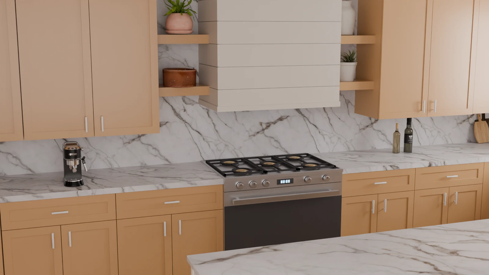
In our second version, we replaced the tile with a vertical surface using the same stone material as the countertop.
Using the same marble-look material for the countertop and backsplash creates a more continuous design, with dramatic veining replacing the grout lines of traditional tile.
The transformation is immediate.
The small, repetitive lines of the tiling give way to large veins that now dominate the wall.
Stone becomes much more prominent throughout the composition.
This solution creates an impression of material continuity and gives the backsplash a more architectural role.
It can be particularly appealing when you want to make the material itself the central element of the design.
However, continuity of the material does not necessarily imply exact continuity of its veining.
Two surfaces can use the same stone without the lines continuing perfectly from one to the other.
To achieve a continuous veining effect, the selection of the slabs, their orientation, and the layout of the cuts must be specifically planned.
What to Consider Before Choosing a Slab Backsplash
Before choosing a slab to match the countertop, consider the overall effect rather than the material in isolation.
A stone with pronounced veining may appear relatively balanced when it covers only the countertop, yet become much more dominant when it also extends up the wall.
Ask yourself the following questions:
Would you like stone to be the main decorative element of the kitchen?
Do you prefer a continuous wall surface or the repetitive pattern of tiles?
Does the veining remain pleasing when visible on a much larger surface?
Have you examined the actual veining pattern on the slabs being considered?
Consider Maintenance, Installation, and Budget
Appearance is not the only factor to consider. A tiled backsplash features grout lines that may require specific maintenance, whereas a slab generally offers a more visually seamless surface.
However, maintenance requirements depend on the material, its finish, any joints, and the manufacturer’s recommendations. A surface without visible joints is not automatically easier to maintain in every situation.
Format availability, required cuts, installation complexity, and total cost can also influence the choice.
Before comparing two quotes, verify that they cover the necessary materials, fabrication, installation, and finishing.
For installation behind a cooking area, also confirm that the material and installation system are suitable for the intended conditions, in accordance with applicable requirements and the manufacturer's instructions.
Two backsplash options with the same veined countertop: white subway tile adds a regular grout pattern, while a matching marble-look slab creates a more continuous, stone-focused design.
In our kitchen, neither of the two solutions is inherently better.
The tiling creates a textural contrast. The matching slab amplifies the presence of the stone.
The right choice depends on the effect you wish to achieve, as well as the material's characteristics, installation constraints, and your budget.
How to Coordinate Countertop and Backsplash Undertones
Two materials can be described as white while exhibiting noticeably different colors.
Some whites have a cream, beige, or slightly yellow undertone. Others lean towards gray or blue. Still others appear relatively neutral.
These subtle nuances are often called undertones.
They become particularly important when the countertop and backsplash are directly adjacent to each other.
Warm White, Cool White, and Neutral White
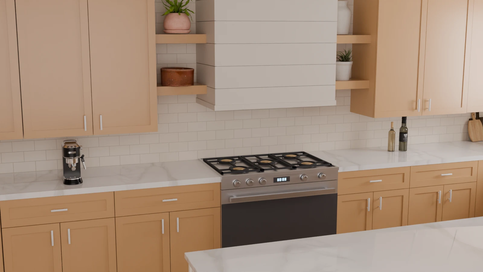
In our kitchen, we paired a light-colored countertop with very subtle veining with a warm ivory backsplash.
A warm ivory backsplash softens the transition between a neutral white countertop and beige cabinetry, creating a cohesive palette without requiring every surface to match exactly.
The cabinets also feature a warm color.
The result is a soft palette in which the various surfaces remain close without being perfectly identical.
The countertop appears relatively neutral, while the backsplash adds a subtle cream nuance.
This combination shows that it is not necessary to use exactly the same white everywhere to achieve a cohesive composition.
A palette can be harmonious thanks to closely related shades, measured contrasts, and a subtle repetition of colors.
Repeat a Subtle Color From the Countertop
When your countertop features multiple colors, its background and veining can serve as starting points.
A white stone with beige-taupe veining can, for example, be paired with an ivory or light beige backsplash that picks up a secondary shade from the material.
A stone with grey veining can also work well with soft grey tiling, provided the undertones are compatible with the rest of the kitchen.
However, picking up a color does not necessarily mean reproducing every nuance of the countertop.
The goal is to create a clear relationship between the materials.
A secondary color can be present enough to connect surfaces without becoming dominant.
Check Your Samples in Different Lighting
Product photographs and digital renderings are useful tools for preliminary selection, but they do not replace the observation of actual materials.
Natural light, artificial lighting, surrounding surfaces, and finishes can alter the perception of colors.
A backsplash that looks neutral in a showroom can appear colder next to cream-colored cabinets. A stone with slight beige tones may look warmer under certain lighting conditions.
Before making a final decision, place the countertop, backsplash, and cabinet samples side by side.
Observe them in the kitchen, at different times of day and under the lighting that will actually be used.
For natural stone or materials with significant variations, also examine the actual pieces or slabs selected, rather than just a small sample.
This step is particularly important when your palette relies on several whites or very similar shades of gray.
How Tile Pattern Changes the Pairing
Even when the material and color remain the same, the tile layout can alter the visual balance between the countertop and the backsplash.
Running Bond vs. Herringbone
In our previous comparison, we used the same heavily veined countertop with two white tile layouts.
The running bond creates a steady horizontal rhythm that complements the lines of the furniture and the countertop.
The herringbone pattern introduces repeating diagonals, lending more movement to the wall.
In our example, this difference remains subtle: the tiles are light-colored and the grout lines lack strong contrast. The veining of the countertop therefore retains the primary visual role.
However, with darker grout lines, smaller tiles, or a more contrasting color combination, the same herringbone pattern could become much more prominent.
The key takeaway: don’t choose a pattern based solely on its name. Also consider its scale, the grout color, and the contrast with the countertop.
Even beautiful materials can result in a disappointing composition when chosen without regard for their surroundings.
Here are the most useful errors to identify before finalizing your selection.
Choosing Materials Separately
A countertop can look magnificent in a photograph. A backsplash can be just as attractive in another kitchen.
However, these two images do not necessarily show how the materials will work together.
The lighting, cabinetry, proportions, and surrounding colors can be completely different.
Always compare materials side-by-side before deciding—ideally under the lighting conditions of your own kitchen.
Ignoring Grout Contrast
Tiling is about more than just the color of the tiles.
The joints create lines that can become very visible when they contrast sharply with the surface.
White tiles with dark grey grout can create a much more prominent grid pattern than white tiles with ivory grout.
This difference warrants special attention when the countertop already features expressive veining.
Assuming Two Patterns Cannot Work Together
Pairing a veined stone with a geometric backsplash is not automatically a mistake.
Our comparisons show that a subtle pattern can coexist with a more expressive countertop.
The real risk arises when multiple surfaces simultaneously exhibit very strong contrasts, dominant directions, and high pattern density, without a clear visual hierarchy.
One should not, therefore, systematically avoid patterns, but rather understand their intensity.
Forgetting the Cabinet Color
The countertop and backsplash are not insulated.
Cabinets often occupy a significant portion of the visual field and influence the perception of other materials.
An ivory backsplash can look soft paired with warm-toned cabinets, whereas the same tile can create a different effect with cool-toned gray cabinets.
The color of the furniture must therefore be part of the selection process from the very beginning.
Assuming Matching Materials Mean Matching Veins
Using the same material for the countertop and the backsplash does not guarantee that the veining will flow naturally between the two surfaces.
When continuity of the veining is an important objective, it must be planned for during the selection and layout of the slabs.
It is better to confirm this aspect before manufacturing than to discover after installation that the lines do not match the desired effect.
A Practical Checklist Before You Commit
Before ordering your countertop and backsplash, use this simple method to verify your choice.
How to Choose Between Two Good Pairings
It can happen that two combinations are both harmonious yet produce different atmospheres.
In this case, the question is no longer determining which one is correct, but rather which one best suits your kitchen.
Start by comparing the two options with the same cabinet colors and under similar lighting.
Next, observe three elements: the surface that first catches your eye, the amount of visual movement created by the patterns, and the overall impression of calm or contrast.
If you particularly love the veining of your countertop, consider whether the backsplash highlights it or draws attention away from it.
If you prefer the wall to play a decorative role, ensure that the countertop leaves enough space for this choice.
Finally, do not base your decision solely on a close-up view. Look at the samples together, then consider their appearance in the context of the entire kitchen.
Two combinations can be successful for different reasons. The best one is the one whose balance you appreciate, both in the details and in the big picture.
Your Final Pairing Checklist
What to Check
Action Before Choosing
Visual hierarchy
Determine which surface should draw the eye first.
Pattern balance
Compare the patterns together from a normal viewing distance in the kitchen.
Grout contrast
Examine the tile with the grout color you actually plan to use.
Undertones
Place the samples side by side with the cabinet color.
Lighting
Observe the materials in natural and artificial light.
Actual slab or tile
Check the variations in the actual materials being ordered.
Maintenance
Consult the care instructions for the selected materials.
Installation and cost
Confirm material suitability, installation constraints, and the complete quote.
If you are still undecided, do not look solely for the combination that appears the most spectacular in a photograph.
Ask yourself which one best suits the desired atmosphere, the other elements of your kitchen, and your daily use.
A successful combination does not necessarily depend on expensive materials or an original pattern. It relies above all on a thoughtful relationship between the surfaces.
Final Thoughts: Choose a Relationship, Not Just Two Materials
The countertop and backsplash are among the most visible surfaces in a kitchen. Their combination therefore strongly influences how the space is perceived.
A heavily veined countertop can become the focal point of an understated design. A subtle countertop can allow more freedom for a textured or geometric backsplash. A matching slab, meanwhile, can transform two distinct surfaces into a visually more seamless whole.
None of these solutions is consistently superior to the others.
The best choice is one that establishes a cohesive relationship between patterns, colors, materials, and cabinetry, while aligning with the effect you are looking to achieve.
Before deciding, look at the materials together, compare their contrast, and check their appearance under the actual conditions of your kitchen.
The secret is not to find two surfaces that look alike, but two surfaces that work together.