Beige tile can warm up a small bathroom, greige can create a subtle backdrop, and hexagons can add geometric pattern. The challenge is picturing how each option will look alongside your vanity and walls.
In this article
- What effect are you looking for?
- 1. Beige stone-look tile for a warmer palette
- 2. Light greige tile to let the vanity stand out
- 3. Light oak-effect planks to introduce a sense of direction
- 4. Off-white hexagons for geometric detail
- 5. Light terrazzo-look tile for a speckled finish
- How to choose between these ideas for your own bathroom
- Our choice for this room
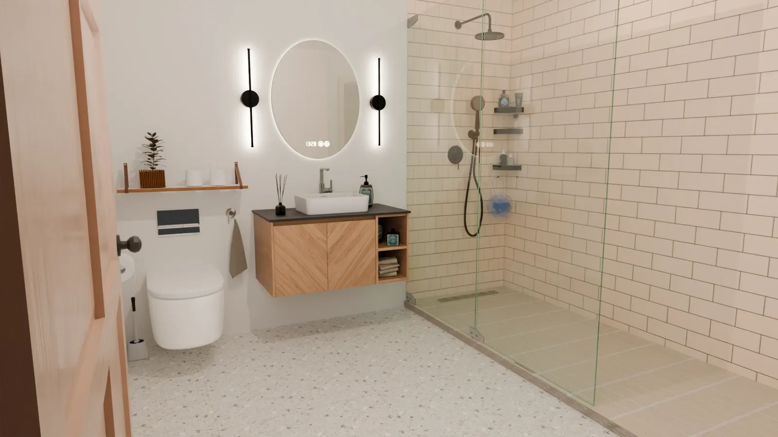
To make it easier to compare bathroom floor tile ideas for small bathrooms, we created five flooring variations in the same 3D-rendered room. The wall-mounted vanity, cream-colored walls, glass-enclosed shower, accessories, lighting, and camera angles remain identical. This lets you compare the effect of each floor without the distraction of five different room designs.
At a glance: greige is our most understated option for this room; beige brings added warmth; oak-effect planks introduce directional lines; hexagons make the geometry more prominent; and terrazzo adds a speckled pattern on a light-colored base.
The images are original visualizations created by Nook & Fern. They compare decorative effects and do not represent an actual renovation or a product test. The oak version illustrates a wood-look finish to inspire your choice of wood-look tile.
What effect are you looking for?
| Your priority | Floor idea | What to consider |
|---|---|---|
| Warm up a cream-colored room | Beige stone-look tile | Its peach undertone can amplify the warmth of the wood. |
| Let the vanity stand out | Light greige stone-look tile | The stone pattern is subtle when viewed from a distance. |
| Introduce longer lines | Light oak-look planks | The wood grain adds another pattern alongside the vanity. |
| Add character through shape | Off-white hexagons | The repeated outlines make the floor more noticeable. |
| Add pattern without strong color contrast | Light terrazzo-look tile | The size and density of the chips can change the overall effect. |
1. Beige stone-look tile for a warmer palette
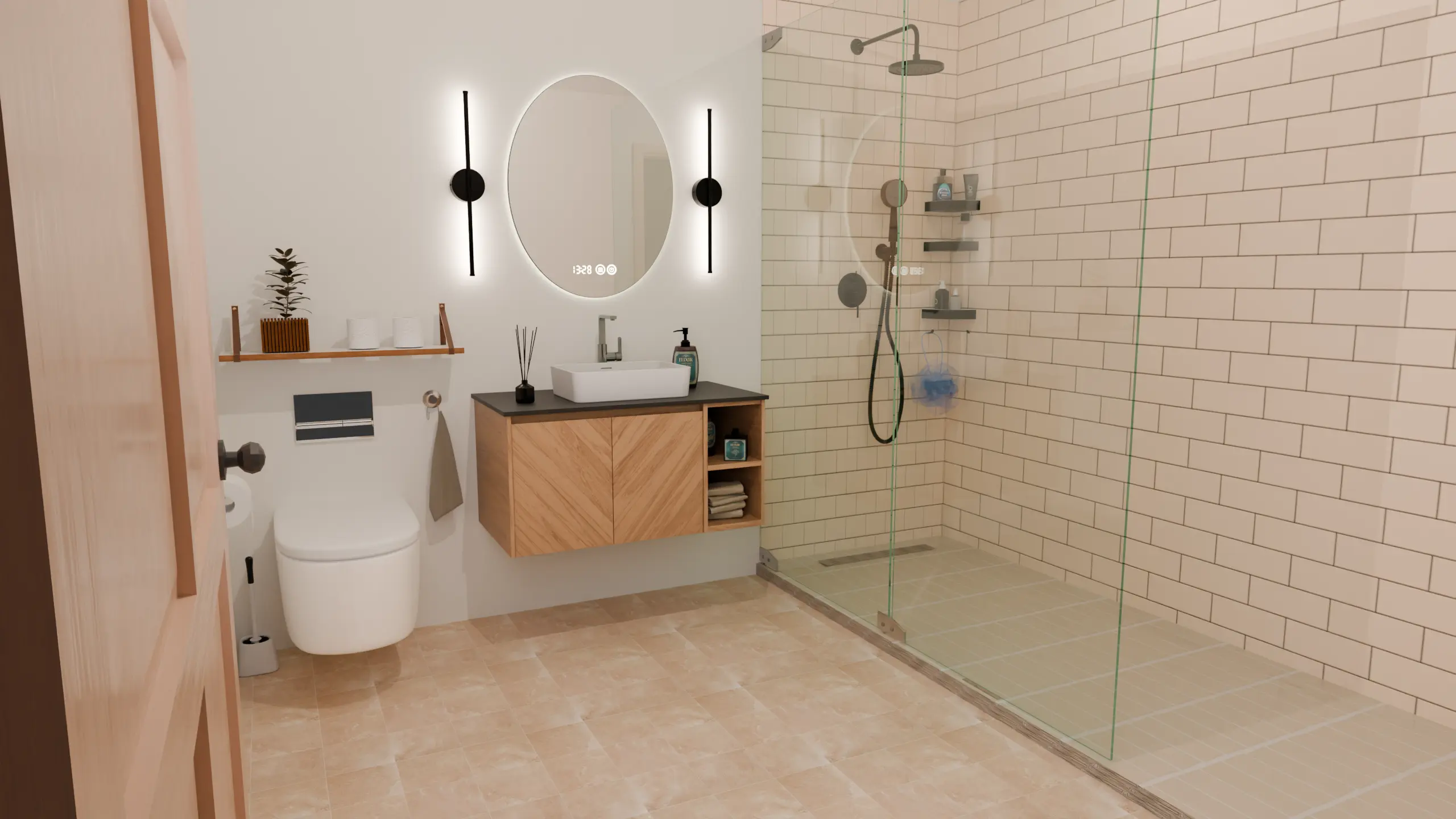
In this variation, beige complements the wood and cream-colored walls. The flooring contributes to a warm palette, rather than creating a sharp division between surfaces.
The undertone matters: in this light, the beige leans slightly toward peach. This creates a warmer effect than a grayish, sandy beige. If your vanity already has golden or orange tones, place a sample next to it to ensure the overall look doesn’t become too warm for your taste.
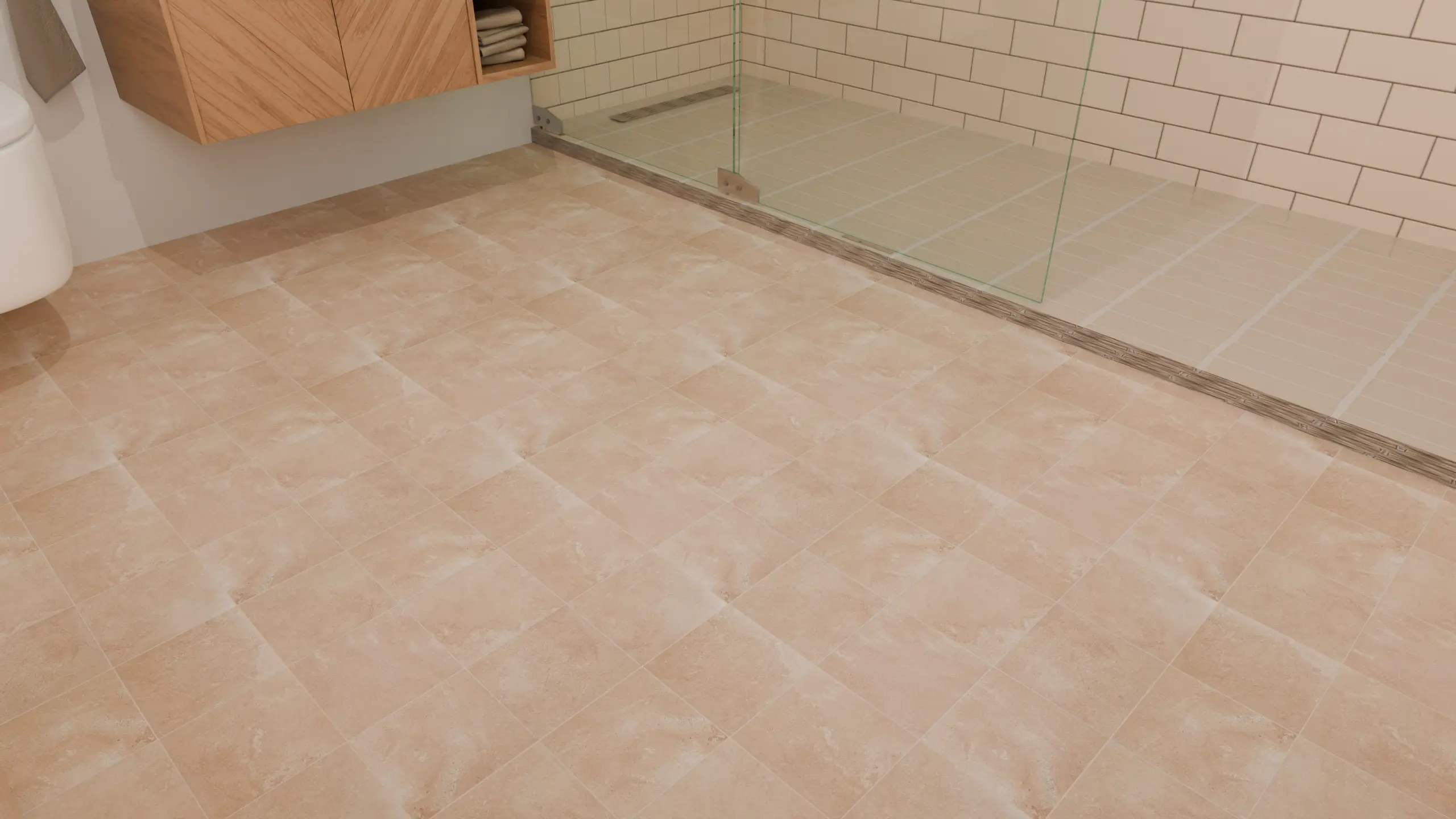
The close-up reveals tonal differences between the tiles. These create a sense of movement across the floor, even though the grout lines remain subtle. When choosing a similar tile, examine several pieces: a single sample may not show the full range of pattern variation.
Choose this option if you want a cozy room with closely related colors. Consider the greige option below if you prefer less warmth.
2. Light greige tile to let the vanity stand out
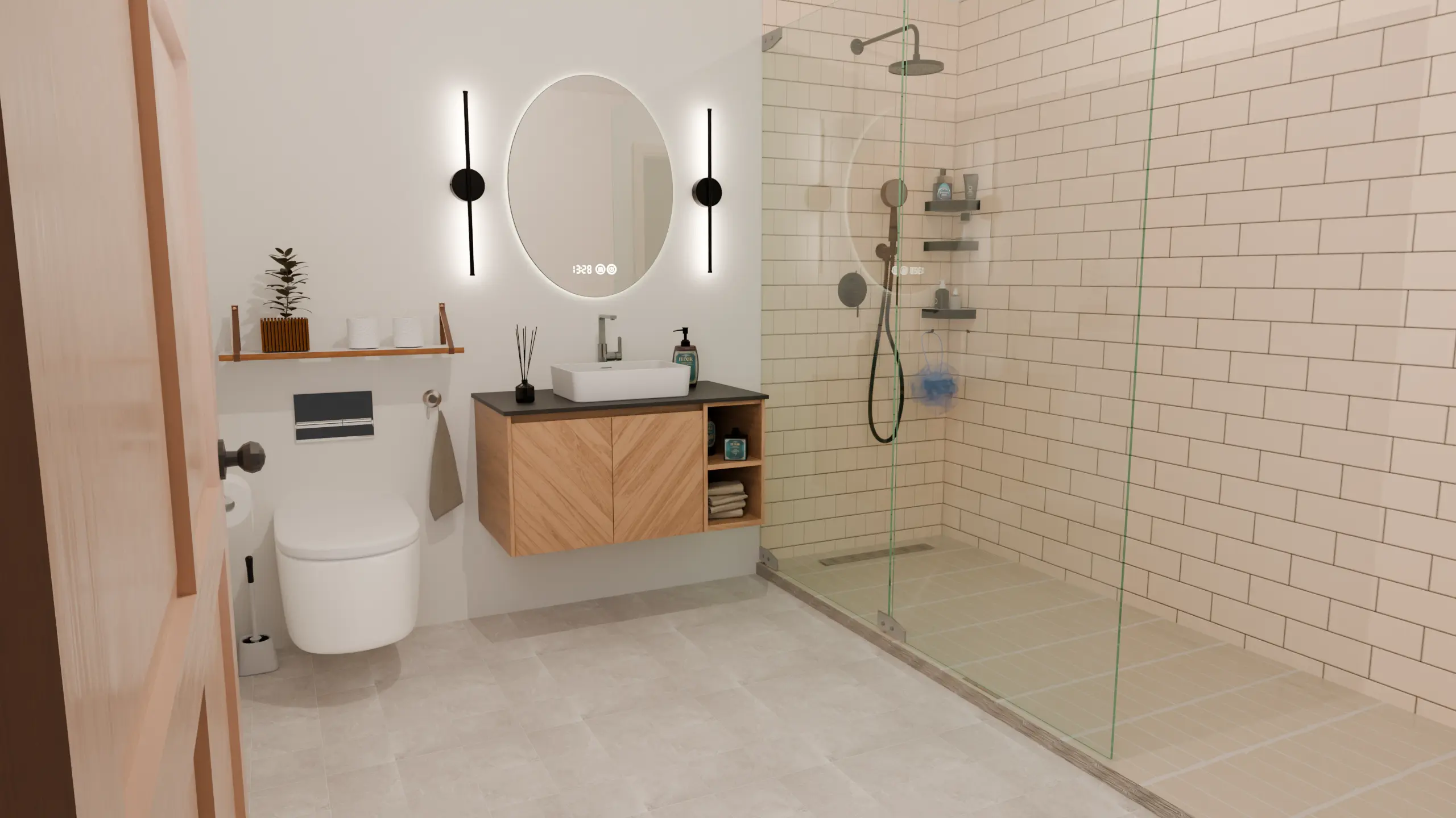
This version has a similar stone pattern to the beige option, but its color changes what catches the eye. The floor draws less attention, allowing the wood vanity to stand out.
Greige—a blend of gray and beige—still works with the cream-colored walls here. It is worth considering if beige feels too warm and gray looks too cool next to your wood finishes.
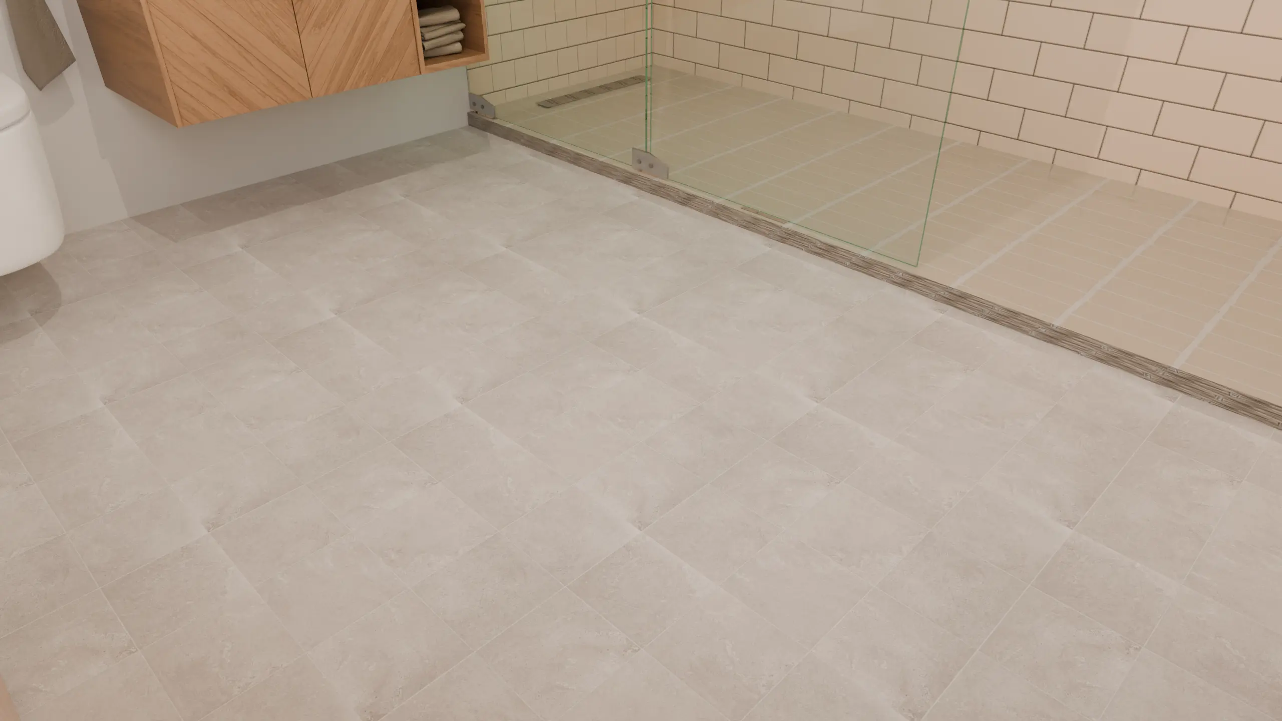
A good choice if your bathroom vanity, wall lights, or walls are already the standout feature of the space. Among our five variations, this is our pick for a restrained, understated look. That preference reflects this room’s palette; a different combination of materials may suit another floor better.
3. Light oak-effect planks to introduce a sense of direction
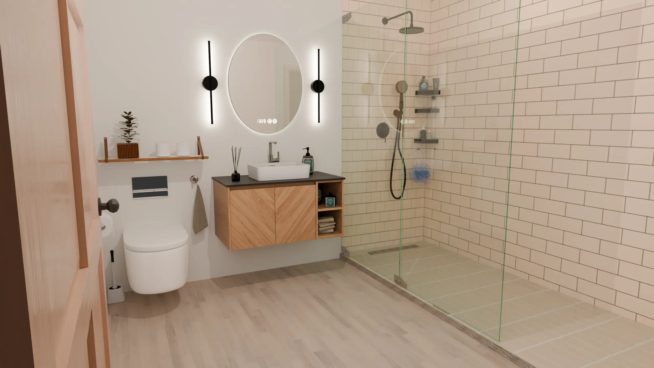
The planks change both the pattern and the direction of the floor. Their lines guide the eye across the open space in front of the vanity and along the length of the shower.
The vanity is more golden than the pale floor. Their patterns also differ: the cabinet fronts have a chevron design, while the floor has straight planks. These differences keep the wood-look surfaces from blending together.
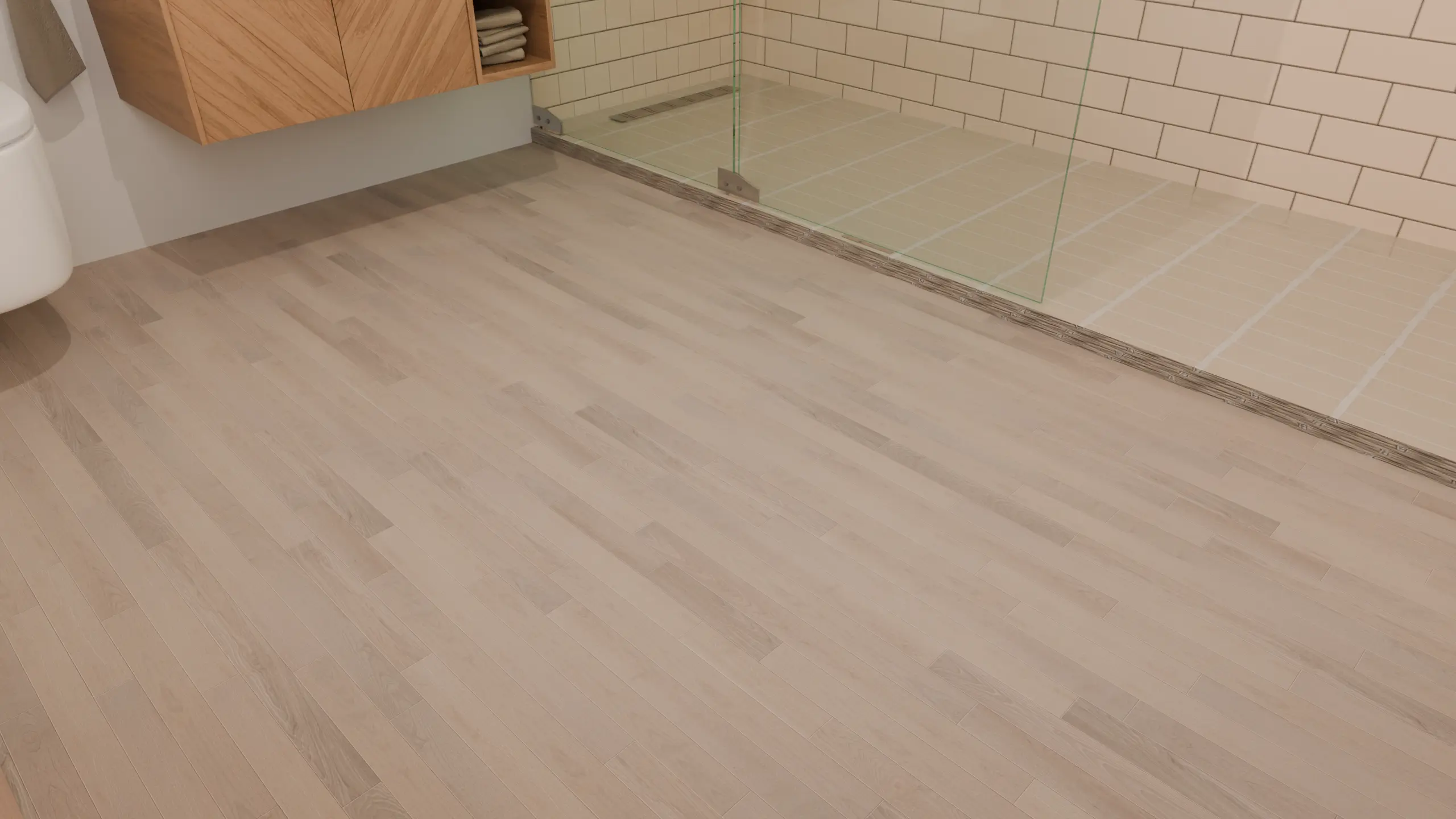
Our visualization illustrates the color, grain, and direction of the planks for an oak-effect floor. When choosing wood-look tile, also check the appearance of the edges and plan for the grout joints in accordance with the manufacturer’s instructions.
A good choice if you like the look of wood and prefer longer lines than those provided by square tiles. Long planks will not automatically make a room feel larger. Consider the laying direction alongside your room’s proportions and layout.
4. Off-white hexagons for geometric detail
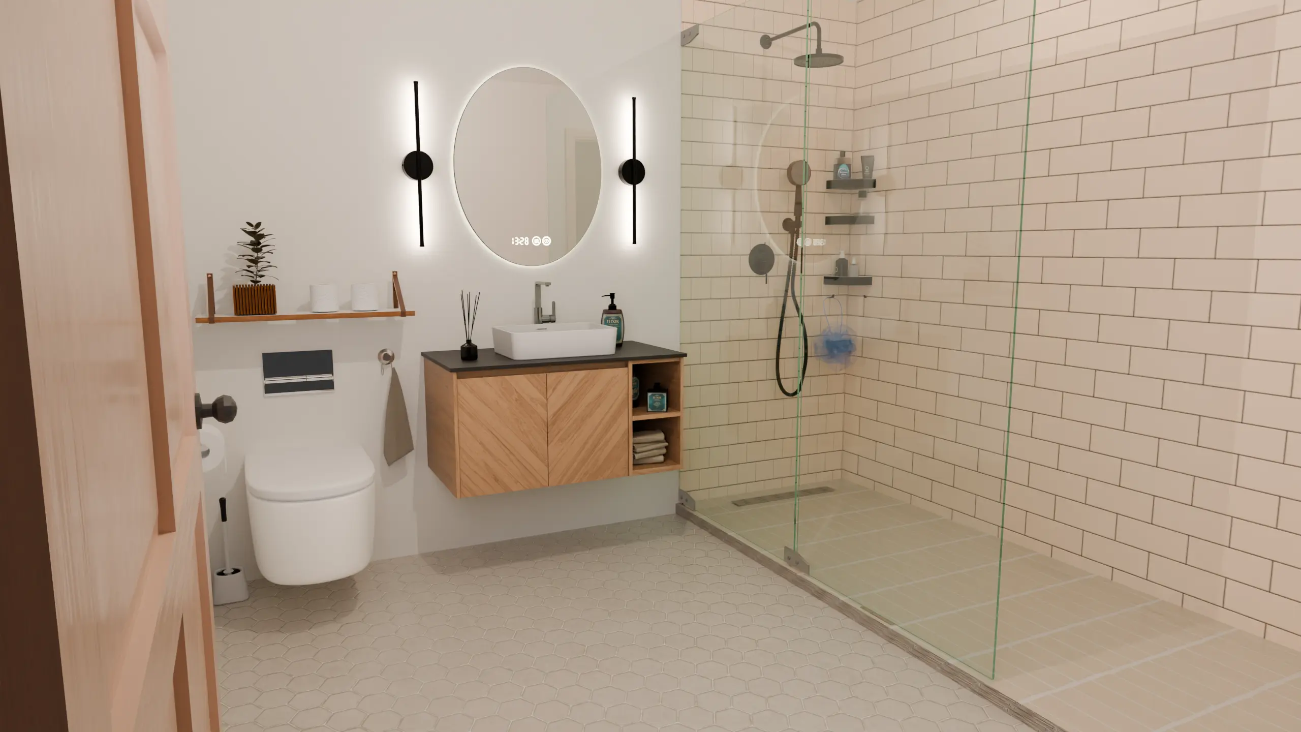
This variation shows that a light-colored floor is not necessarily subtle. The repeated outlines of the hexagons catch the eye more than the grout lines of the greige squares.
The shower walls already feature a rectangular pattern. The hexagons introduce a second geometry: an interesting combination if you enjoy patterns, though perhaps a bit busy if you are looking for a quieter overall look.
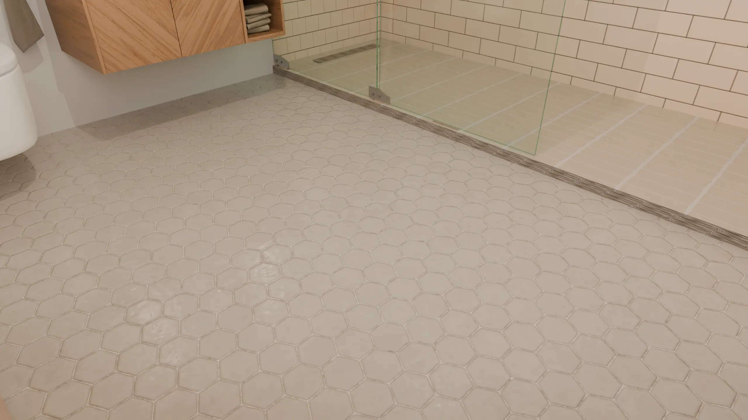
The edges appear quite pronounced in our close-up. If you would prefer a more understated look, you might also want to compare samples featuring flatter, more uniform hexagons.
Choose this option if you want the shape of the tiles to contribute to the decor. Consider the grout in relation to the tile: a similar color softens the pattern, while a contrasting grout makes it stand out more.
5. Light terrazzo-look tile for a speckled finish
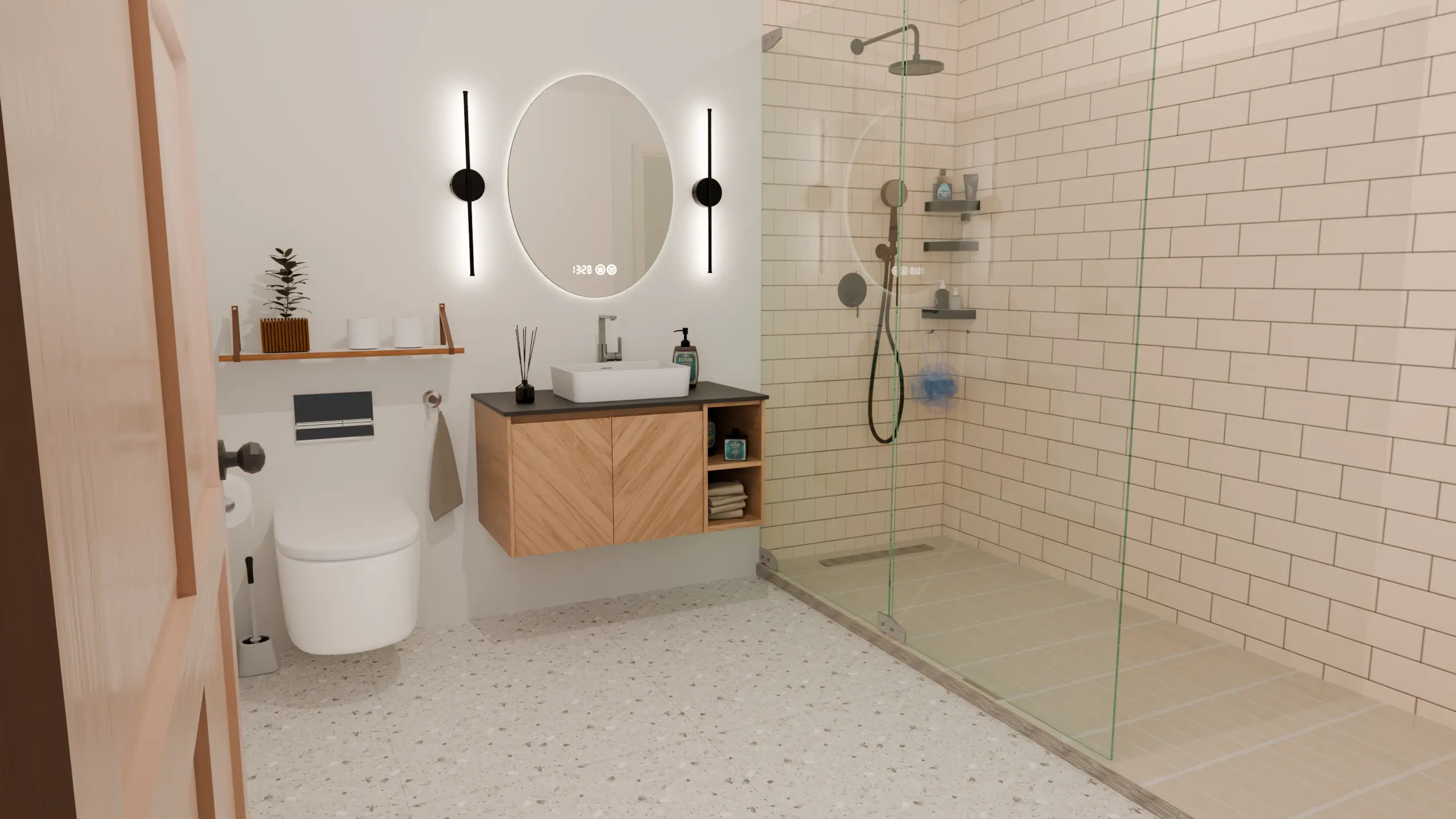
The terrazzo-look floor is our favorite decorative option for this room. Its cream-colored base complements the walls, while the beige, gray, and white fragments add texture to the open area in the foreground.
Its scattered chips create a different pattern from the repeated outlines of the hexagons. The joints are barely noticeable; it is primarily the fragments that bring the surface to life.
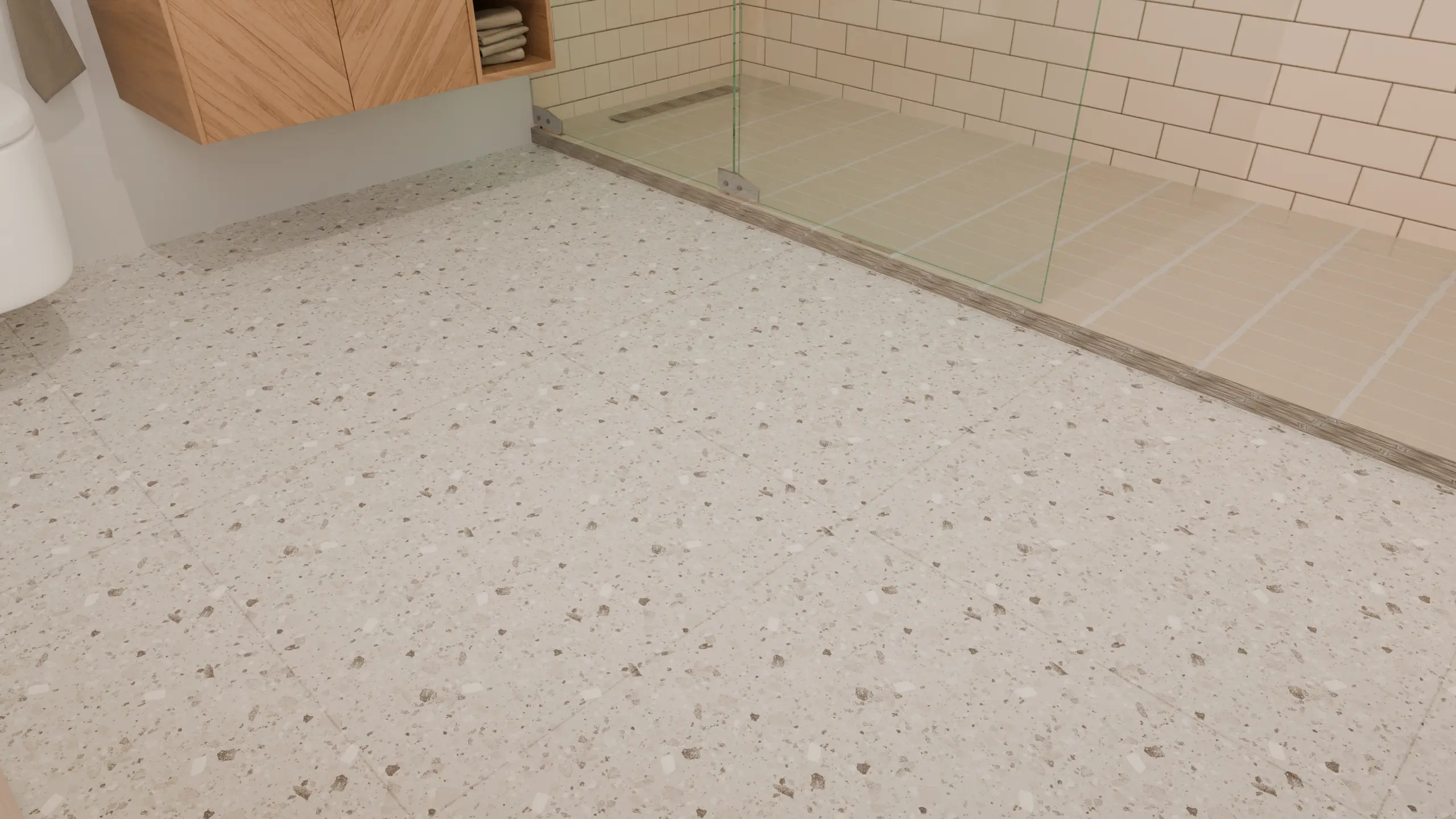
The size of the chips matters just as much as the background color. Larger, darker, or denser fragments would create a different impression. Before making a choice, look at a surface large enough to understand the repetition of the pattern.
A good choice if you are looking for a decorative floor without strong color contrasts. For a more understated look, we would opt for greige instead.
How to choose between these ideas for your own bathroom
Start with the items you are keeping
Start with the colors of your vanity and walls. In our images, beige enhances the warmth of the wood, while greige creates a more neutral foundation. If your walls are already highly detailed, compare quieter floor patterns with low-contrast grout lines.
Plan the tile size and cuts, not just the look
These renderings do not establish a universally best tile size or layout. Sketch out the tile arrangement based on the actual dimensions of your room, accounting for furniture, doors, and the shower. Compare the visible lines and the small cuts required along the edges. Use the images for inspiration, rather than as a measured installation plan.
Choose the grout at the same time as the tile
Our light-colored hexagons and squares have different visual impacts. To minimize a grid-like effect, consider a grout color that closely matches the tile. To highlight the shape, opt for a higher-contrast grout. Follow the tile manufacturer’s installation instructions when choosing the grout joint width.
Examine the sample under your own lighting
Place it on the floor near the vanity, then observe it at different times as you use the room. A store photograph or a digital visualization does not guarantee how the color will appear in your own home. Examine several tiles if the design features veining or noticeable color variations.
Check bathroom floor and shower floor suitability separately
In our comparison, the shower floor remains the same in order to isolate the effect of the main flooring. You can aim for color continuity without requiring the exact same product throughout. Check the product specifications for approved uses and slip-resistance information. Confirm that any tile intended for the shower floor is suitable for your shower’s layout and drainage requirements. A matte or textured appearance alone is not sufficient to establish such suitability.
Our choice for this room
We would opt for light terrazzo-look tile for its balance between a soft background and decorative details. Light greige would be our alternative, if we wanted the vanity to stand out more.
If warmth is your priority, consider beige; if you prefer long, sweeping lines, look at oak-effect finishes; if you are seeking a bolder geometric look, explore hexagonal patterns. Then, select two options and compare their samples against the materials you are keeping: this helps you move from inspiration to a choice that works with your room.
Enjoyed this article? Share it.